VelquinceRetail (flower studio)
Identity for our own concept brand, a flower studio: we designed and built the wordmark and the V icon.
- Versions shown
- 4
- Palette
- Plum #2B1830
- Paper #F4F0E8
- Chartreuse #D7E06F
The marks
Every version that exists, each on the panel colour it is meant for.

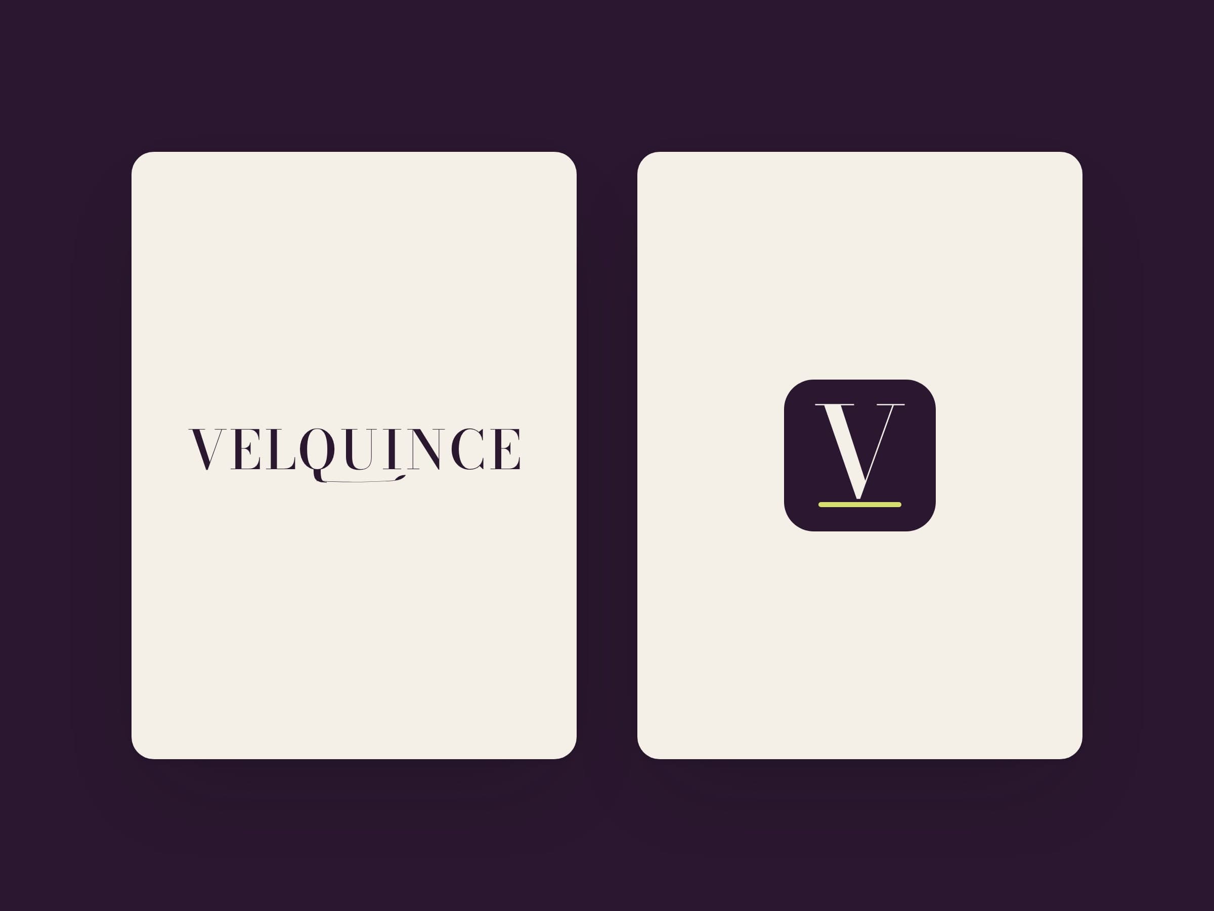
Lockup wordmark on paper 
Reversed wordmark on plum 
One colour on white 
Primary mark V tile, on paper
- The idea
- The name is set in Bodoni Moda capitals with spacing adjusted pair by pair. One detail is drawn: the tail of the Q runs on under the U and I as a fine stem and ends in a small leaf. There is no flower icon; the small-size mark is a V over a chartreuse rule.
- Our role
- Identity for our own concept brand, a flower studio: we designed and built the wordmark and the V icon.
In use
Compositions of the same files, to show the marks at the sizes they are used.
Visual application Gift enclosure card
Need a mark that holds up everywhere?
We design the logo, its lockups and colour versions, and hand over files for print, screen and social.