VelquinceA flower shop website with a working bag, built as our own concept
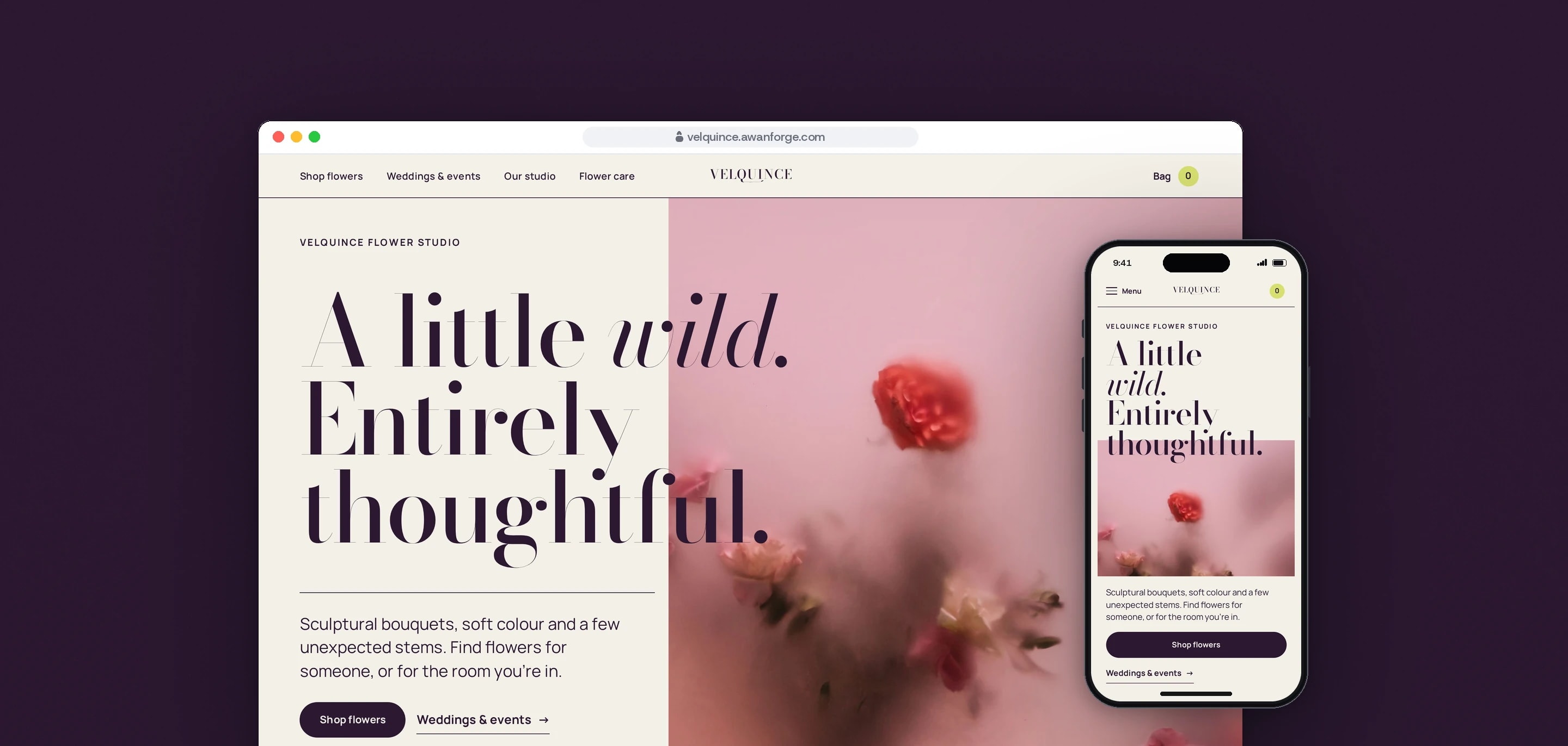
Velquince is a concept flower shop our team designed and built: a shop with filters, seven bouquet pages with sizes and gift notes, a bag, a review step and a brief builder for event flowers. The florist, catalogue and prices are illustrative, the photographs are licensed stock from Pexels, and no payment is taken or order sent.
- Client
- Own project
- Sector
- Flowers and gifts
- Year
- 2026
- Platforms
- Website
- Services
- Product and UX design, Web development, Brand and graphics
A complete website for an independent flower studio. A visitor filters a small collection by colour, format and price, picks a size, adds a gift note, fills a bag and takes one last look at it. A separate page turns a few answers about a wedding or event into a short flower brief. We built it to show the whole journey working in the browser, with the review step stating that nothing is charged.
Built for
- Independent florists who want a shop that looks like their work and is simple to buy from.
- People choosing flowers for someone else, who start from a colour and a budget before any flower name.
- Couples and hosts planning event flowers, who need their ideas in a few clear lines they can send to a florist.
The problem
Flowers are chosen by eye, often for someone else. A flower shop’s site has to show the photographs large and still keep the price, the size and the next step easy to find.
A concept shop carries a second duty. A bag and a last step that look real can mislead a visitor, so every place where a trading shop would charge or send something has to say what happens here.
Large photographs, a film and scroll motion are heavy on a phone. The pages had to load fast, hold their layout as images arrive, and show a still, finished layout to people who reduce motion.
Goals
- 01Filter the collection by colour, format and price, and keep the filter in the address so a reload opens the same view.
- 02Show the price beside the size choice and change it as soon as a size is picked.
- 03Keep the bag through a refresh, with every total worked out from the catalogue.
- 04State at the review step and in the terms that no payment is taken and no order is placed.
- 05Give event planning a tool that needs no account and no contact details.
- 06Show the largest element on screen within 2.5 seconds on a phone, with layout shift under 0.1.
- 07Credit every photograph and film to its creator, with a link to the source.
Our role
We named the studio, set its look, wrote the copy and built the whole site, from the direction brief to the release on our own server.
What we delivered
- A brand direction: the name, a wordmark with one drawn detail, a palette of paper, plum, citron, petal pink and stem green, and two typefaces
- 20 pages plus a 404: home, shop, seven bouquet pages, bag, review, weddings and events, studio, flower care with two articles, contact, credits, terms and privacy
- Shop filters for colour, format and price with four sort orders, kept in the address
- Size cards, a gift note of up to 240 characters and a phone bar that keeps Add to bag in reach
- A bag drawer, a bag page and a review step that share one saved bag
- A flower brief for events that can be copied or saved as a text file
- Two flower care articles, each with its sources listed
- A build step that saves each photograph in two modern formats at several widths, and each film as a 10-second excerpt
- A credits page for 14 photographs and two films, and a deploy script that checks each release and returns to the previous one if a check fails
How we worked
- 01
Direction before code
We settled the name, the palette, the two typefaces and one visual idea, the flower counter after hours, and gave each photograph a set place on the site before building a page.
- 02
Words that say what happens
Navigation and buttons use literal labels: Shop flowers, Choose a size, Review your arrangement. Product copy names the colour, the shape, the wrapping and whether a vase is included.
- 03
A bag that checks itself
Each time the saved bag is read it is checked against the catalogue. Items that no longer exist are taken out and the visitor is told, quantities stop at ten, and prices always come from the catalogue.
- 04
Motion with a still version
The hero entrance has a desktop and a touch version, and the film scene on the home page runs on desktop only. With reduced motion the page shows its finished layout straight away.
- 05
Reviewed, then tested on the live site
A separate review drove the site at four screen widths and reported eight defects, which were fixed and tested again. The journey test then ran against the deployed site.
Screens and features
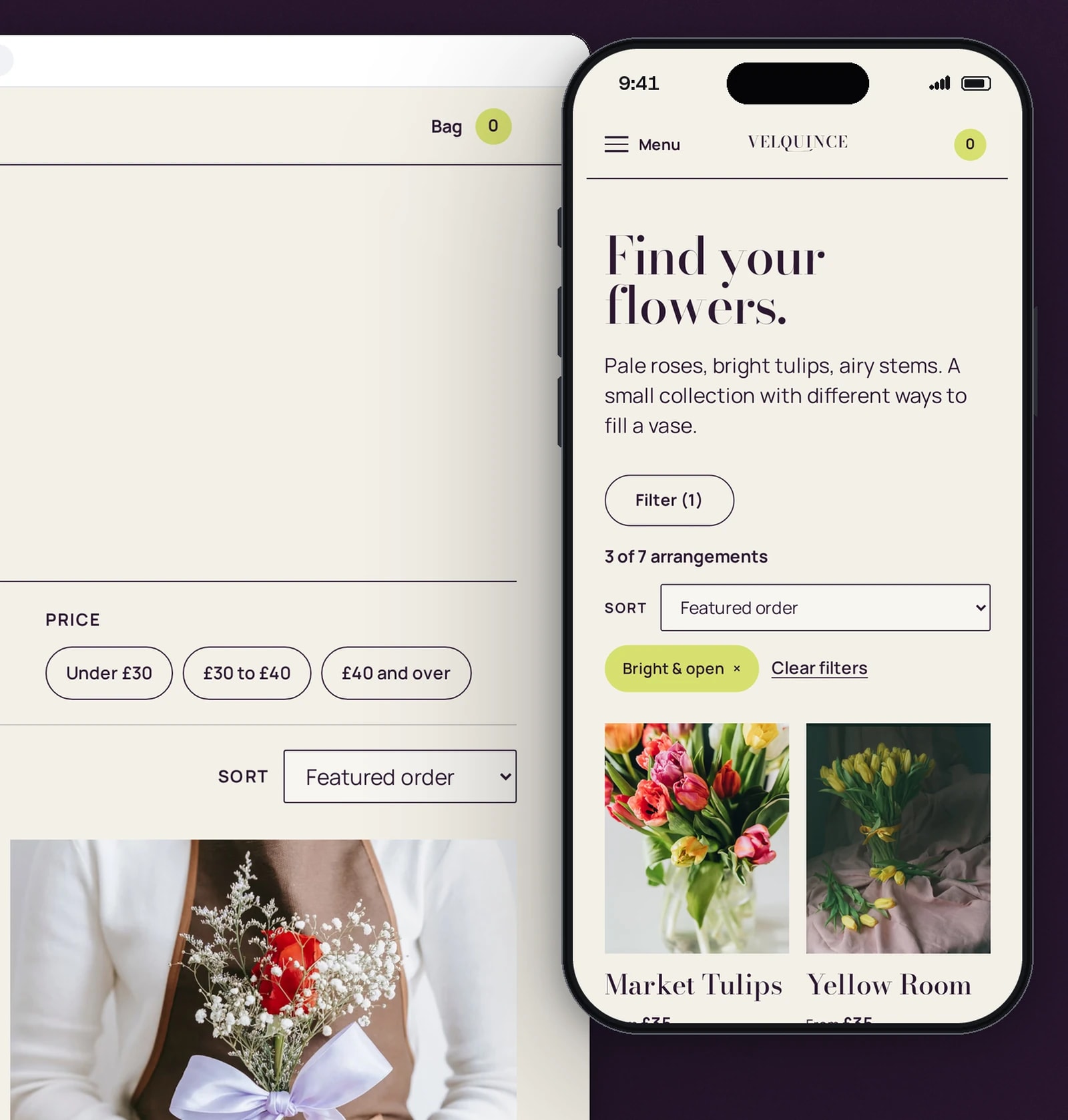
Filter by colour, format and price
Chips narrow the seven arrangements in place and the address keeps the choice. On a phone the filters fold behind one button.
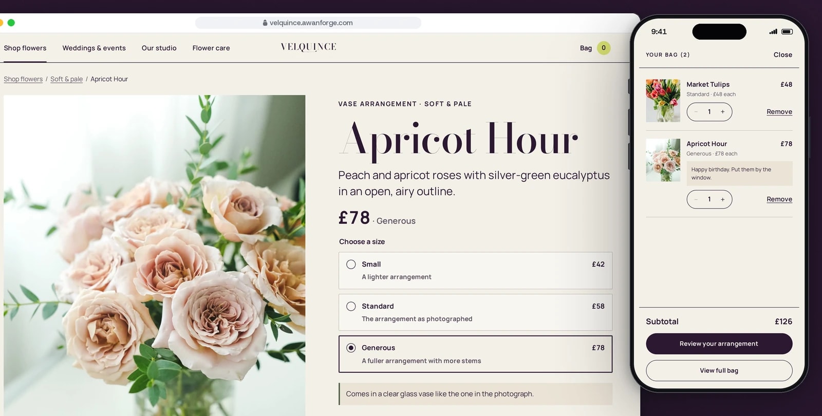
Pick a size, add a few words
The price follows the size. A gift note travels with the bouquet into the bag, shown here on a phone with the subtotal.
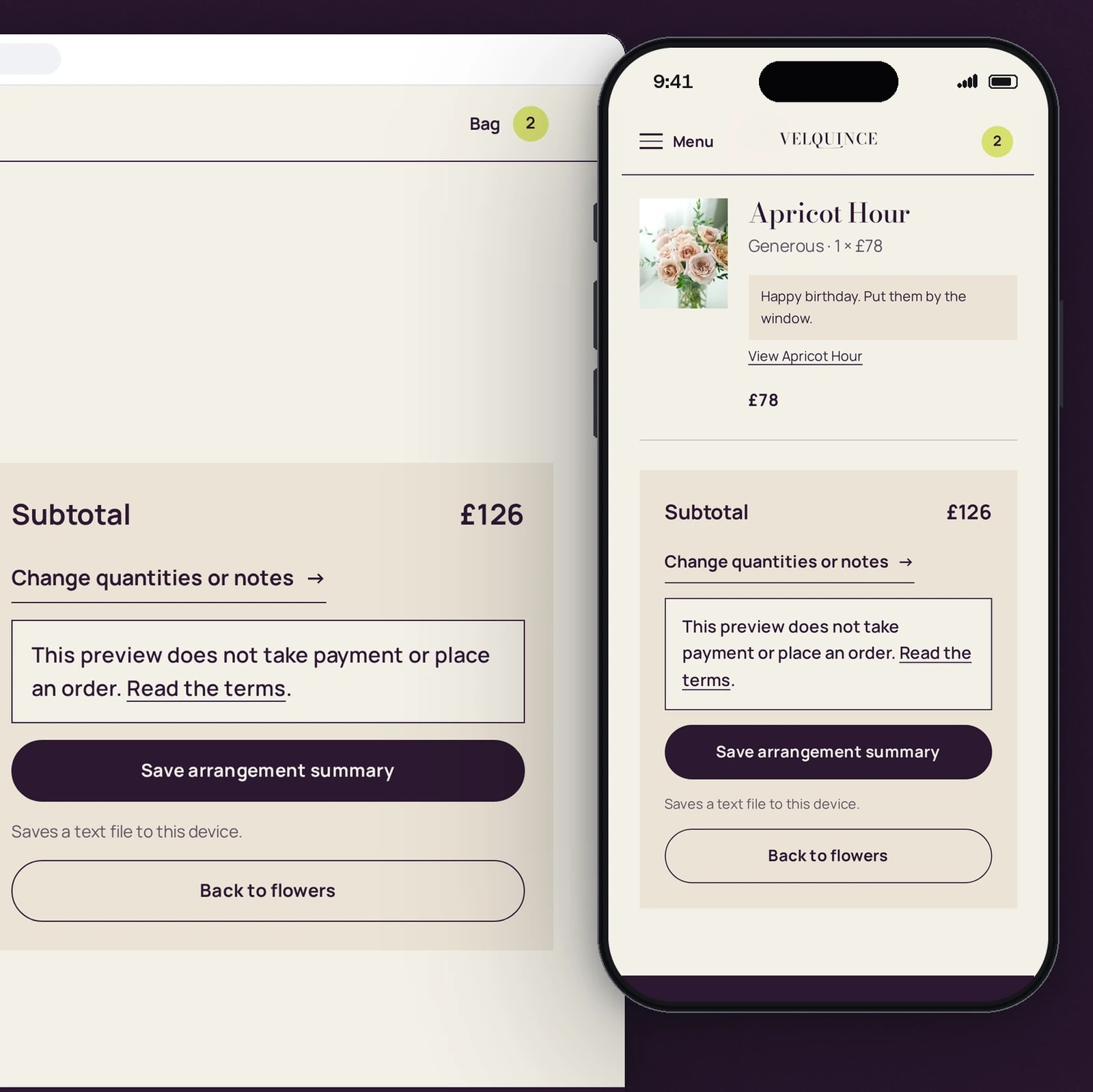
A last look that takes no payment
The review step lists each line and the subtotal, and says in plain words that nothing is charged or ordered. The summary saves as a text file.
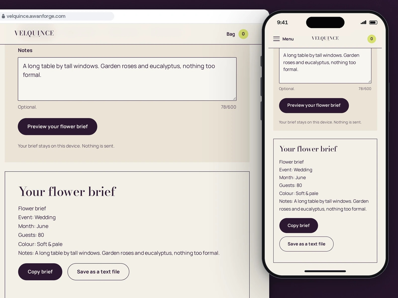
Event plans, written as a flower brief
A few answers become a short brief to copy or save. It stays on the visitor’s device and nothing is sent.
A phone layout of its own
A full-screen menu, filters that open under one button, and a bar that keeps the price and Add to bag at the bottom of the screen.
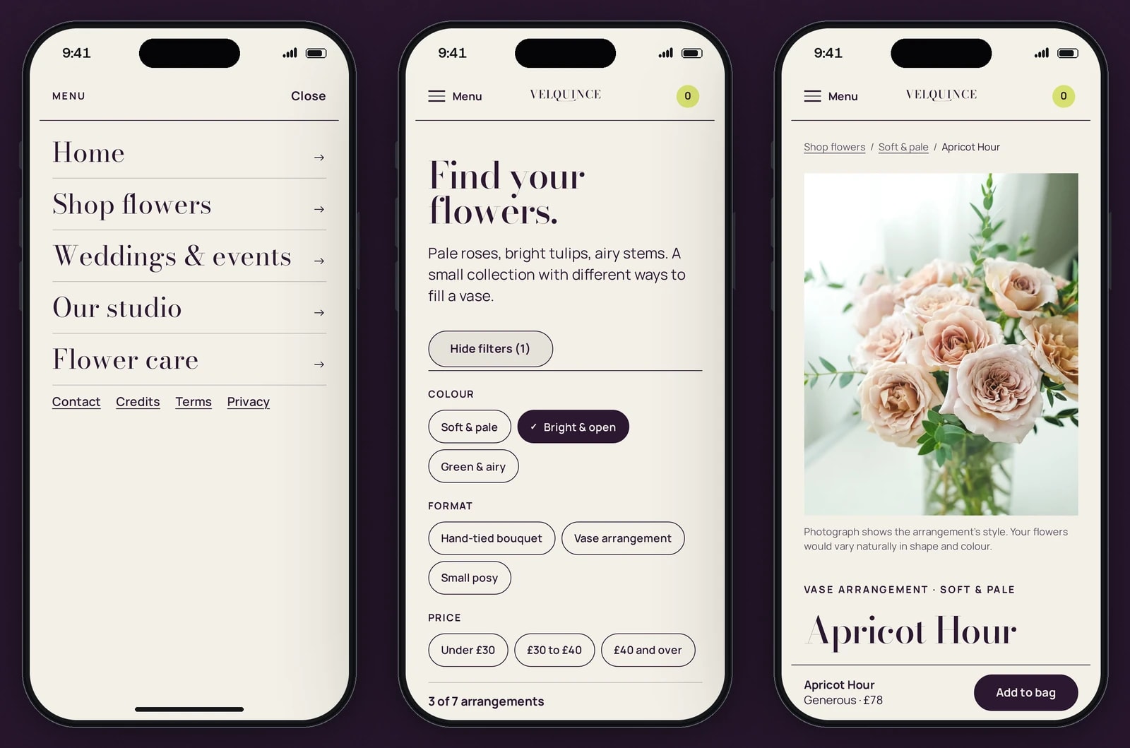


Filters that stay in the address
Colour, format and price narrow the seven arrangements in place, with a count of what is left. A reload keeps the selection, and a combination with no results offers one button to clear it.
The price follows the size
Six arrangements come in Small, Standard and Generous, each with its price and a line on what changes. Choosing one updates the price by the heading and on the Add to bag button.
A gift note that stays plain text
A note of up to 240 characters travels with the bouquet through the bag and the review. Whatever is typed is shown as text and never treated as code.
One bag in three places
The drawer, the bag page and the review step read the same saved bag, so they always agree. It is still there after a refresh, and it is kept only in the visitor’s browser.
A double tap adds once
Two taps on Add to bag within a moment count as one, and a line’s quantity stops at ten. Each change to the bag is also passed to screen readers as a short message.
A review step that charges nothing
The last step lists every line and the subtotal and states that no payment is taken and no order is placed. The visitor can save the summary as a text file.
A flower brief for events
Five questions about the event, the month, the guests, the colour and any notes become a short brief. Every problem with the answers is shown at once, and the draft is kept through a refresh.
Credits for every picture
The credits page names the creator of each of the 14 photographs and two films, links to the source and says where on the site it is used.
Technical choices
What the product is built with, and why.
- Next.js 16 as a static export, with React 19
- Every page is prerendered to HTML and served as plain files, so the photographs, names and prices arrive before any script runs. The site has no application server and no database.
- GSAP with ScrollTrigger
- It runs the hero entrance, the scroll reveals and the film frame that opens as it enters the screen. The hero has a desktop and a touch version, the film scene runs on desktop only, and every animation is undone on a route change.
- The browser’s own dialog element
- The bag drawer and the phone menu are native dialogs. Focus stays inside them, Escape closes them and focus returns to the button that opened them, with no dialog library loaded.
- Plain CSS with design tokens
- Colours, type sizes and spacing are tokens in one stylesheet, and no CSS framework is loaded. Plum ink on warm paper carries the reading, with citron as the one sharp accent.
- sharp and ffmpeg at build time
- Each photograph is written as AVIF and WebP at up to five widths, with its size and main colour recorded so its box is reserved before it loads. The films download only when their frame is near the screen.
- Fonts served from the site
- Bodoni Moda sets the display type and Manrope everything a visitor reads or presses, both under the SIL Open Font License. Loading a page contacts no other company, and the site sets no cookies and runs no analytics.
- Playwright for the journey test
- 51 checks walk the shop on desktop and on a phone: filters, sizes, the note limit, the bag after a refresh, a tampered bag, the review notice, the brief and a real 404.
- nginx with release folders
- Each release is uploaded to its own folder and switched in. The deploy script then checks seven pages and a 404 over HTTPS and switches back to the previous release if any check fails.
Outcomes
Lighthouse 96 to 98 on mobile, 100 on desktop
On a simulated slow 4G phone the home page, the shop and a bouquet page scored 96, 98 and 97 for performance, with the largest element on screen in 2.3 s, 1.8 s and 2.3 s (single runs 1.8 to 2.6 s) and layout shift between 0 and 0.07. On desktop each scored 100, with the largest element on screen in 0.4 to 0.6 s. Accessibility scored 98 to 100, SEO 100 and best practices 96, and each page weighed about half a megabyte (452 to 557 KiB).
Evidence: Lighthouse 13.5.0 lab runs against velquince.awanforge.com on 11 November 2026, the median of three runs per page. These are lab measurements; no visitor data is behind them.
51 of 51 journey checks passing
The test walks the live site at desktop and phone sizes. Among its checks: a filter survives a reload, a 241-character note is refused, a double tap adds once, the bag survives a refresh, a tampered bag is priced again from the catalogue, and the review step states that no payment is taken.
Evidence: the project’s Playwright journey test, run against the live site on 11 November 2026 with no failures.
Eight review defects found and fixed
A separate review at 1920, 1440, 390 and 360 pixels wide reported eight defects, among them the phone shop filters, double-tap adds and the place of the sort control. All eight were fixed and tested again before the handover.
Evidence: the project handover of 9 November 2026.
Velquince is an Awan Forge concept, built as our own demonstration project. It is not a trading florist: the catalogue, sizes and prices are illustrative, the bag and the review step run in the visitor’s browser, no payment is taken and no order or enquiry is sent. The photographs and films are licensed stock from Pexels, credited one by one on the site’s credits page, and they show people and arrangements not connected with Velquince. The figures above come from lab tools and automated checks.
Selling something people choose by eye?
We build shops where the photographs lead and the price, the size and the next step are easy to find. Tell us what you sell and how people buy it.