Skimvero Pool CareHome services (pool care)
Identity for our own concept brand, a residential pool care business: we directed the mark and built the full vector system.
- Versions shown
- 8
- Palette
- Marine #0B343A
- Paper #F4F4EA
- Citrus #DBF674
- Aqua #6CCDC4
- Secondary marine #37656A
The marks
Every version that exists, each on the panel colour it is meant for.

Lockup on paper 
Reversed lockup on marine 
Lockup stacked, on paper 
Primary mark on paper 
Primary mark aqua accent, on paper 
Reversed mark on marine 
One colour on white 
App icon citrus tile
- The idea
- The mark is a freestanding S made from two opposing sweeps with an open waterline running between them, a reference to skimming a pool surface. The wordmark is outlined Sora at weight 800 with tight tracking, and a lighter, widely spaced POOL CARE line sits under it. The same S works alone, in one colour, and with the lower sweep in aqua.
- Our role
- Identity for our own concept brand, a residential pool care business: we directed the mark and built the full vector system.
In use
Compositions of the same files, to show the marks at the sizes they are used.
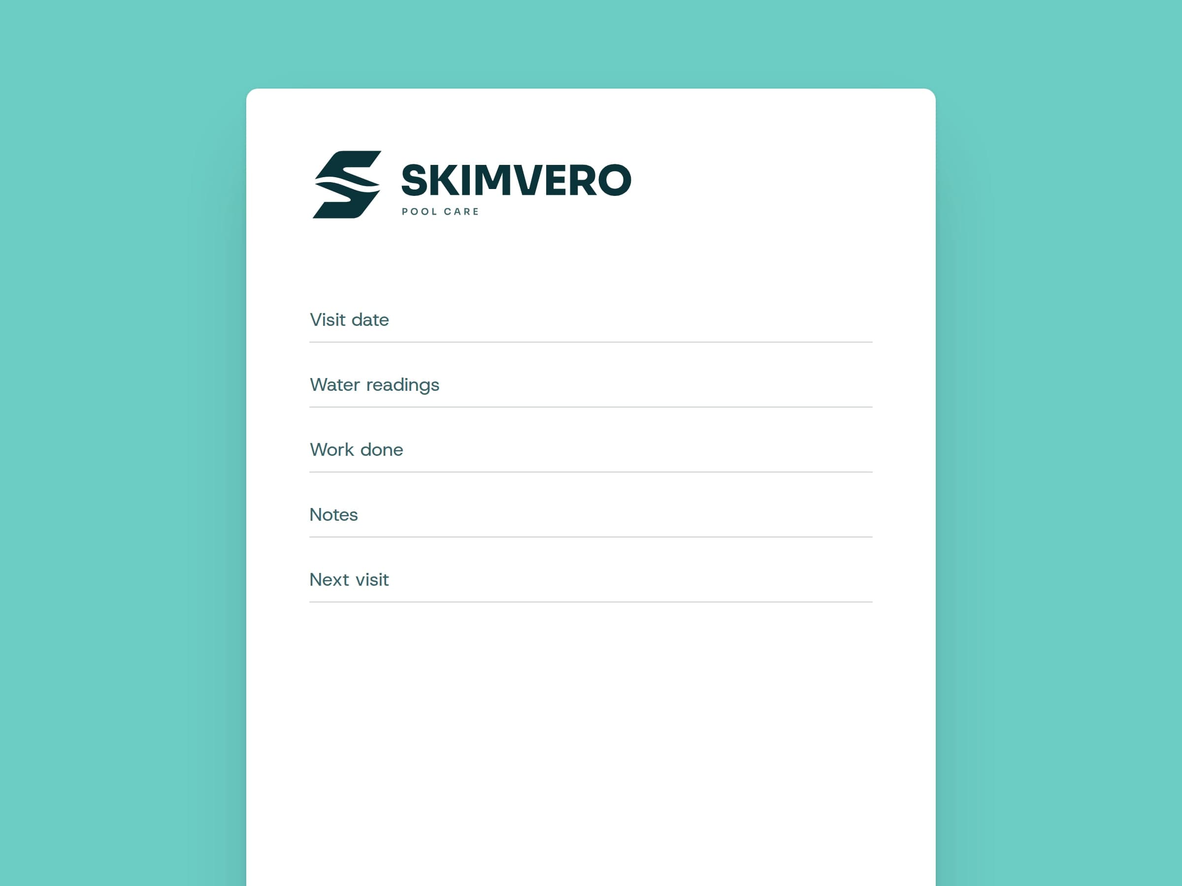
Visual application Visit report card left after a service
Need a mark that holds up everywhere?
We design the logo, its lockups and colour versions, and hand over files for print, screen and social.