StabilityOur studio’s website while it traded as Stability
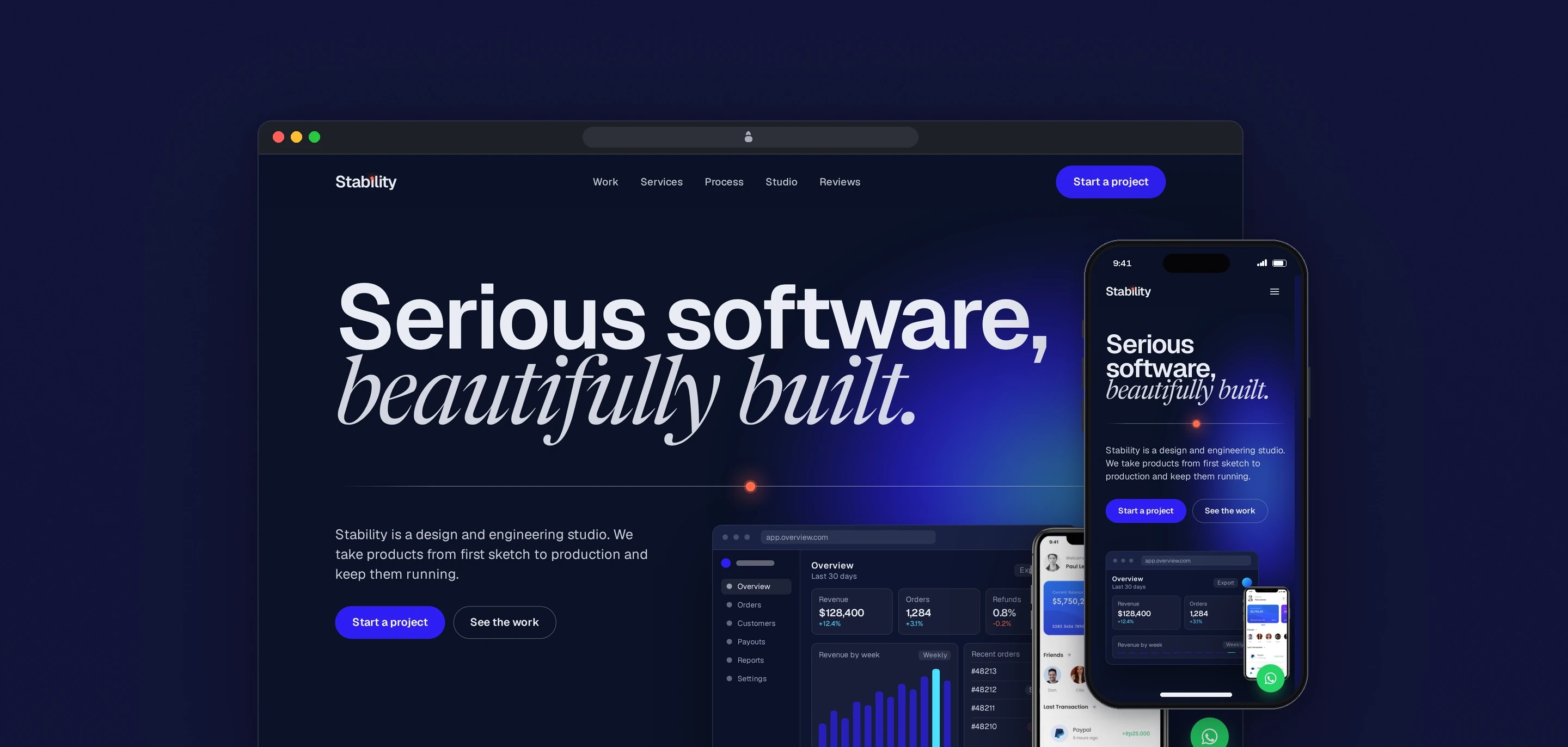
Awan Forge traded as Stability until 2026, and stability.digital was its website. In 2026 we redesigned it around six products we built, shown in real screen captures, with a short path from the work to a conversation on WhatsApp.
- Client
- Awan Forge
- Sector
- Design and development services
- Year
- 2026
- Platforms
- Website, Mobile web
- Services
- Product and UX design, Web development
The studio’s public home under its previous name. It shows the products the studio has built, the services and how a project runs, reviews from Freelancer clients and answers to common questions, and it ends every path at a way to start a conversation.
Built for
- Businesses and founders looking for a team to design and build a website, web app or mobile app.
- Clients on Freelancer, where most of the studio’s projects are agreed, checking its work before they hire.
The problem
The earlier homepage described services in general terms over stock photographs, and its portfolio button linked to the Behance home page, so a visitor could not open a single product the studio had built.
Every page loaded jQuery and a third-party WhatsApp widget, pulled from a code-hosting CDN, to show one floating button.
The structured data that search engines read was written inline on the page, separately from the reviews and questions visitors saw, so the two could say different things.
Goals
- 01Show real products before services, process or any contact step.
- 02Use captures of the running products, with a link wherever the product is public.
- 03Keep reviews, questions and structured data in one source.
- 04Open a conversation in one step, by WhatsApp, email or Freelancer.
- 05Drop jQuery and the chat widget, and use native browser features where they do the job.
Our role
We redesigned and rebuilt the homepage in 2026, moved the site to Nuxt 4 and Tailwind CSS 4, and deployed it to the studio’s own server.
What we delivered
- Art direction: navy and chalk bands, Geist with Newsreader italic, and a spirit level as the signature
- Work section built from 2x captures of six products in browser and phone frames drawn in CSS
- Earlier work shown as twelve presentation boards in a sideways row
- Services, project process, studio, reviews, questions and contact sections
- Reviews, questions and structured data read from shared JSON files
- Contact field that opens WhatsApp with the visitor’s message written in
- Upgrade from Nuxt 3 to Nuxt 4 and from the Tailwind module to Tailwind CSS 4
- One layout for the six legal pages
How we worked
- 01
Put the work first
After the headline and a roll of client names, the page goes straight to six products. Services, process and contact come after them. Each product tile is tinted with a colour from that product’s own palette.
- 02
Use real screens, and label the illustration
Every product tile shows captures of the running product. The one drawn screen is the hero dashboard: it is built in CSS, its figures are fictional, and screen readers hear it as a single illustration.
- 03
One source for the page and for search
Reviews, questions and the organisation’s details live in JSON files. The page renders from them, and the structured data is serialised from the same files, so what a visitor reads and what a search engine reads cannot disagree.
- 04
Let the browser do the work
The questions are native details elements that close each other through a shared name, the scroll reveal is a CSS scroll-driven animation, and the menu is a plain button and list. jQuery, the chat widget and Headless UI were removed.
Screens and features
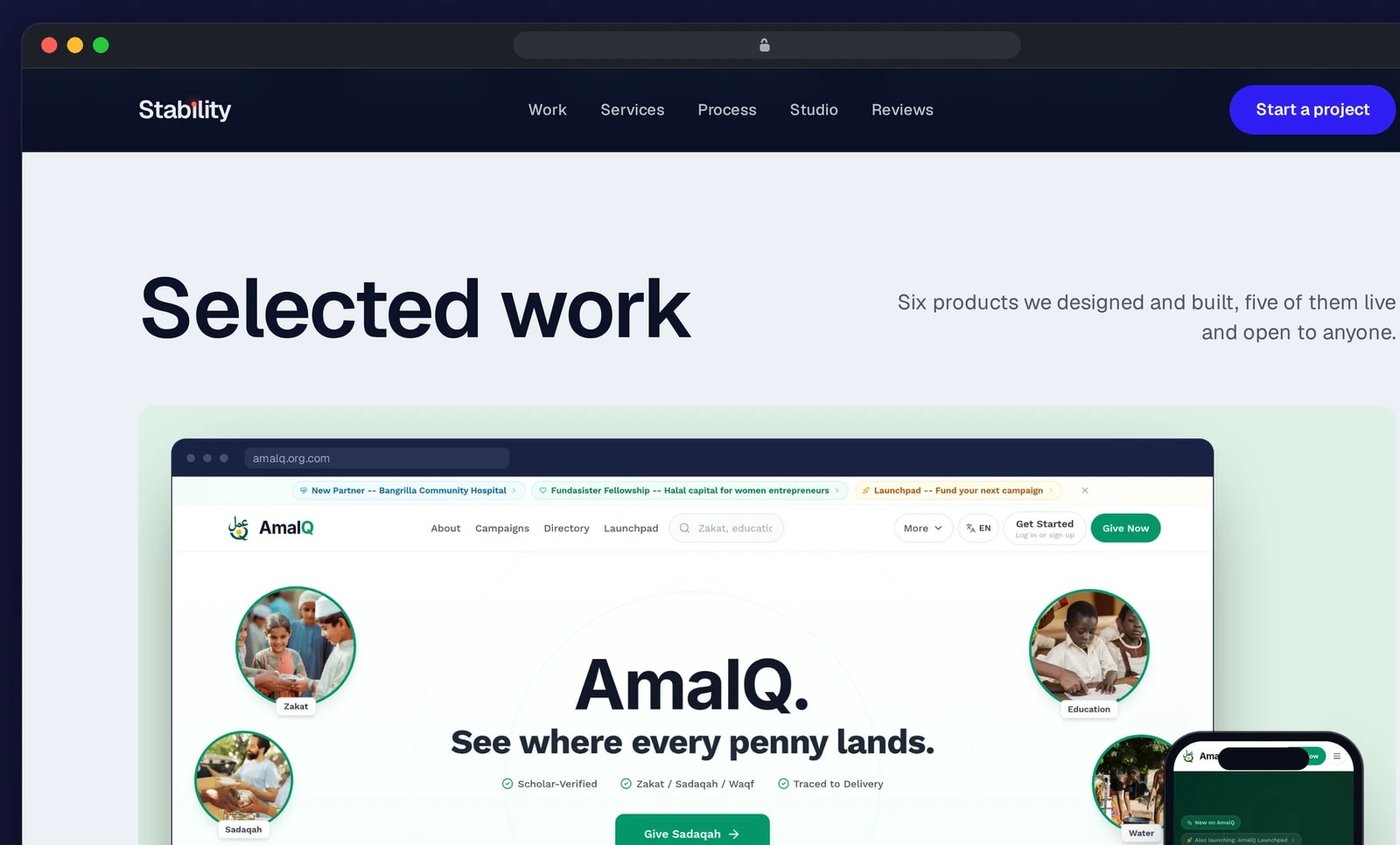
Client work before any contact step
The homepage shows client projects first, then services, process and the tools the studio builds with.
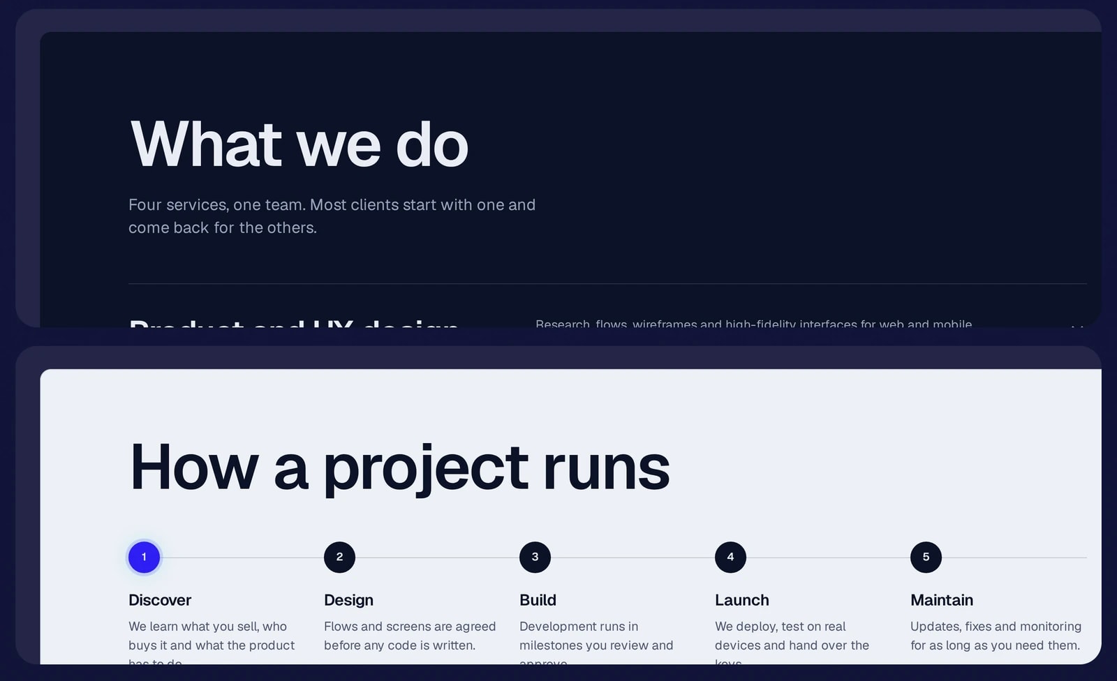
Services and process, stated plainly
What the studio does, and the five stages every project runs through.
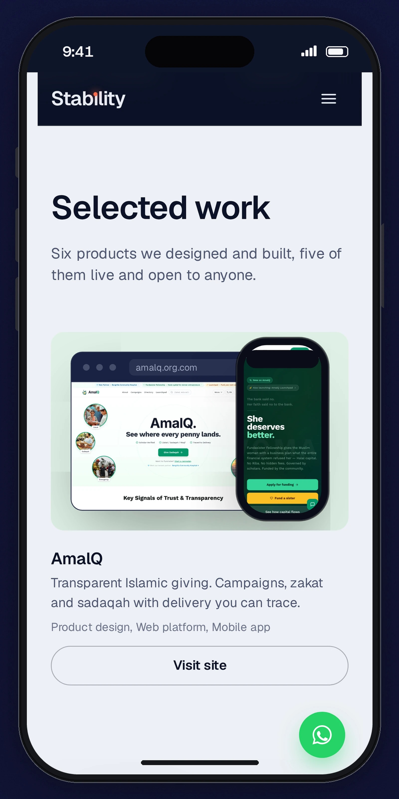
The same site on a phone
Client work, services and contact, laid out for one column.


Four tile layouts
A browser with a phone over its edge, two phones side by side, one browser screen, or two stepped dashboards with a phone, chosen per product. Public products get a Visit site button; a client platform is labelled as one and has no link.
A spirit level as the signature
A hairline with a bubble that settles at the centre runs under the hero headline and forms the dot of the i in the wordmark. It draws itself once as the page loads.
Motion that respects the setting
The hero’s entrance, the moving roll of client names, the scroll reveal and the hover lift on the work tiles all stop for visitors who ask for reduced motion.
WhatsApp in one step
The contact field opens a WhatsApp chat with the visitor’s message already written. An empty message gets a prompt to describe the project, so nobody lands in a blank chat.
Reviews with an announced position
Freelancer reviews run in a carousel with previous and next buttons and a counter that screen readers announce as it changes.
Contact details in one file
WhatsApp, email, Freelancer and the social profiles are defined once. The footer, the contact, studio and questions sections and the floating button all read from that file.
Technical choices
What the product is built with, and why.
- Nuxt 4 with Vue 3.5
- The site was already a Nuxt app. Moving up a major version kept its pages and routes and brought the toolchain up to date.
- Tailwind CSS 4 through its Vite plugin
- Colours and fonts are defined as theme variables in one stylesheet, which replaced the separate Tailwind config file.
- Google Fonts linked by hand
- The Nuxt fonts module could only request weight and italic. Newsreader needs its optical size axis so the large italic lines get the display cut, so the stylesheet link is written in the config.
- Embla Carousel
- A small carousel library drives the reviews, and its select events keep the counter and the hidden slides in step for screen readers.
Need a company site that leads with the work?
Real product screens, structured data that matches the page and a short path to a conversation are all part of the build. Tell us what you want to show.