ShiftcrestA shift scheduling landing page with a sample week to fix
Shiftcrest is one of our own products, at the landing-page stage: weekly scheduling for cleaning, maintenance and field-service teams. We designed and built a page that opens on a bad Thursday morning, lets the visitor cover the gaps in a working sample week and publish it, and ends with a request for a scheduling consultation that is stored and answered by email.
- Client
- Own product
- Sector
- Workforce scheduling
- Year
- 2026
- Platforms
- Website
- Services
- Product and UX design, Web development, Brand and graphics
A landing page for the person who builds the week’s schedule for a small service crew and sends it out by group message. It has to show, in a few minutes, that a gap in the week is impossible to miss and quick to fill, and then ask for a conversation about how their team is scheduled today.
Built for
- Owners and operations managers running 5 to 40 cleaners, maintenance staff or technicians across several sites.
- Crew members, whose own week on a phone is shown so the manager can judge what there is to learn.
The problem
Someone calls in sick at six in the morning, the plan lives in a group chat and a spreadsheet, and a site goes uncovered. The buyer is short of time, wary of software that needs training and wary of a sales call.
The action is a consultation, which can read as a sales pitch. The page had to say what the conversation covers, who replies and that sending the form books nothing.
The roster had to work on a phone. Seven days of shifts do not fit in 390 pixels without squeezing every name.
Goals
- 01Show the whole week in one grid, with open shifts marked by a pattern, an icon and a word.
- 02Let the visitor fill a shift in two steps: open it, then assign someone the picker says is free.
- 03Update the coverage count, open shifts and hours per person as each change is made.
- 04Allow Publish week only when the week is covered and nobody is over their hours.
- 05Explain the consultation before the form, with no length, price or start date that is not decided.
- 06Keep the week readable with JavaScript off and usable by keyboard and touch.
Our role
We wrote the page, set its design system, chose and licensed the photographs, rebuilt the logo as a vector system from approved artwork, built the sample week and the request flow, and released it on our own server.
What we delivered
- A section order led by a story: one Thursday morning, four steps to fix the week
- A design system: colour tokens with measured contrast, Archivo on its width axis, IBM Plex Mono for figures, a 12-column grid
- The logo rebuilt as a vector system from approved artwork: lockup, mark, wordmark, reversed and one-colour versions, favicons and a sharing image
- A working sample week with a picker, coverage summary, hours bars, undo, reset and publish
- A day-by-day roster for phones and a crew view drawn in HTML
- Two licensed photographs, checked at full size for logos and readable names
- A consultation request form, a privacy page, a contact page and a branded 404
- Lead storage and the signed-in lead list shared with the two sibling pages, testing and the release
How we worked
- 01
A depot noticeboard
Warm paper, strong ink, heavy condensed headings and mono figures on a visible 12-column grid. Blocks sit edge to edge on 2px ink rules, the way shifts sit on a roster.
- 02
Photography for the human half
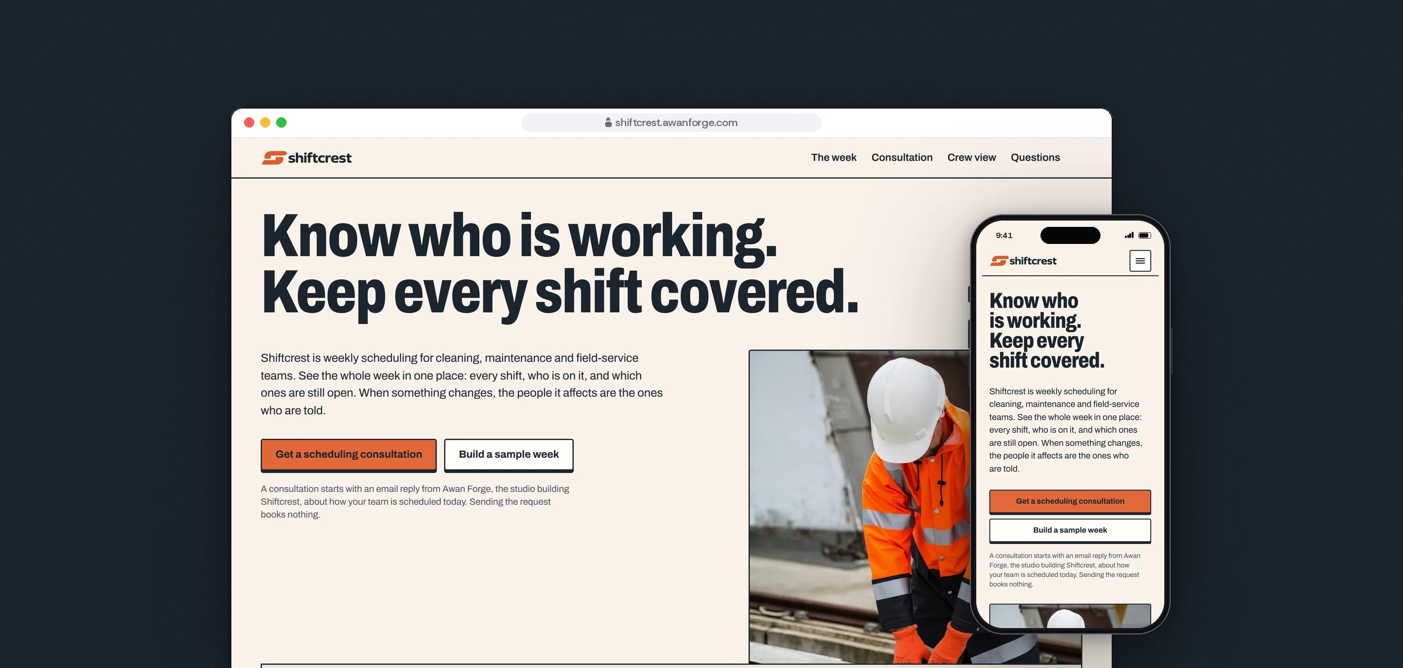
The hero sets one photograph of a maintenance worker at real work under a heading set tight across the page, with a strip of the week overlapping its lower edge. Nothing on the page suggests the people pictured use Shiftcrest.
- 03
The story before the product detail
The first section is a morning: Jonas is off sick, Thursday at Harbour Offices is open, and four numbered steps lead to a published week. The consultation comes next, before any further detail, because it is what the page asks for.
- 04
An orange that can carry text
The logo orange reaches 3.43:1 on the page, too low for button labels. The button uses a lighter orange with ink text at 4.65:1, keeps a 2px ink border, and the logo files are never recoloured.
- 05
One day at a time on a phone
Under 768 px the grid becomes seven day buttons and one day’s shifts as a list, with the picker opening in place under the shift. The four story steps fold into one card so the roster starts in the same view.
Screens and features
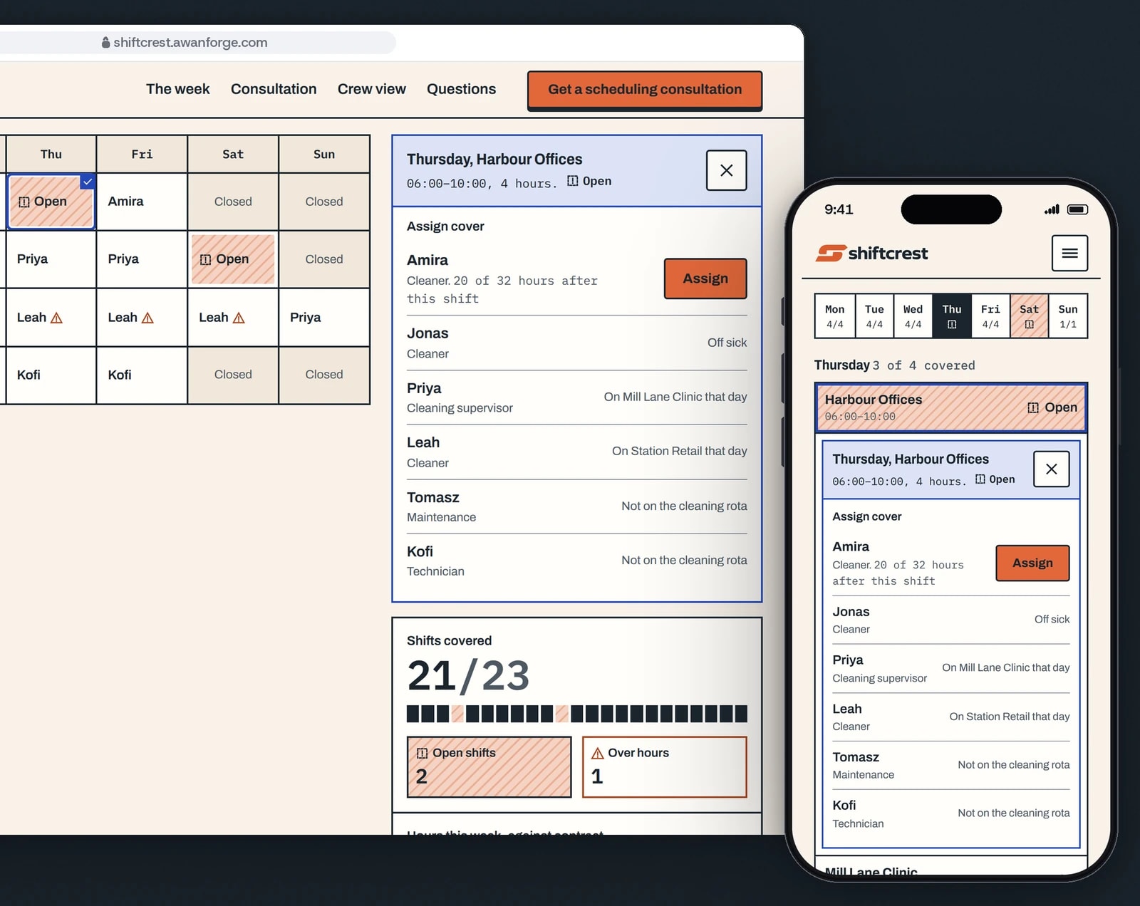
Open a shift, see who can take it
The picker lists the whole crew for that day, with the reason when someone cannot take the shift. The coverage count sits under it.
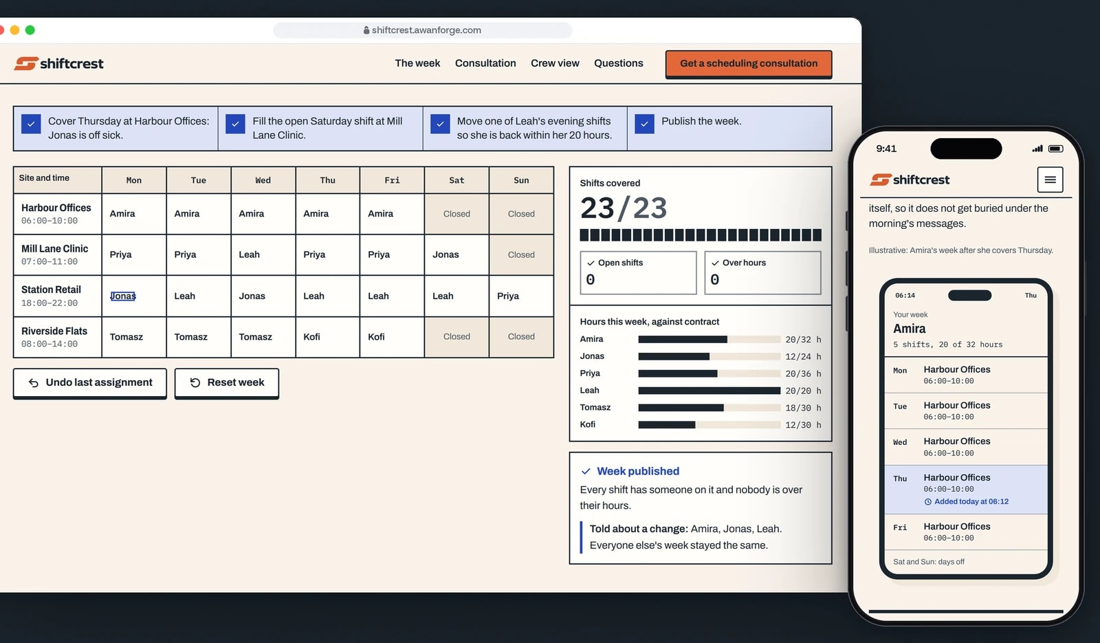
A full week, then publish
Publish week opens when every shift is covered and nobody is over their hours. Each person sees a changed shift marked on their own week.
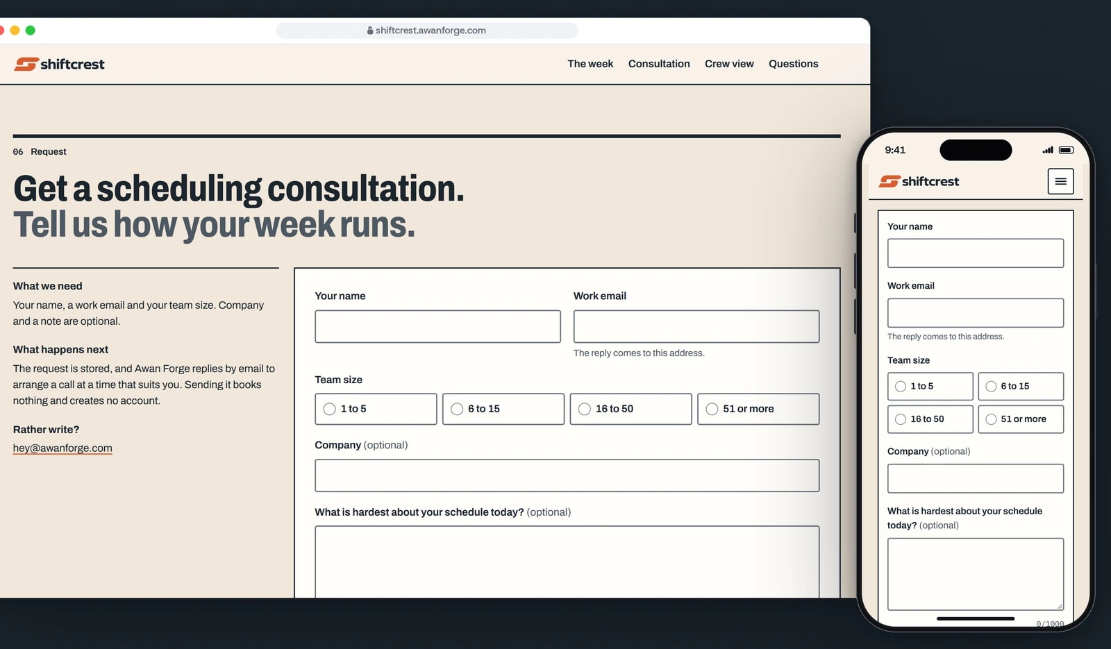
A conversation about the schedule
Name, work email and team size are required. The text beside the form says what happens next and that sending it books nothing.


An open shift you cannot miss
Open shifts carry an orange hatch, a dashed-square icon and the word Open. A person over their contract hours carries a warning triangle, and neither state depends on colour alone.
A picker that gives reasons
Opening a shift lists every crew member for that day. The ones who cannot take it say why: off sick, already on another site, or not on that rota.
Counts that move with the week
Shifts covered, open shifts, people over hours and each person’s hours against contract update with every assignment, and a polite status line announces the new count.
Publish, and who was told
Publish week explains what is left until the week is complete. Once published, it lists the people whose shifts changed; everyone else’s week stayed the same.
The crew’s own week
A phone drawn in HTML shows Amira’s five shifts after she covers Thursday, with the new shift marked Added today at 06:12.
Keyboard first
The grid is one tab stop. Arrow keys, Home and End move through it, Enter opens the picker and Escape closes it, and focus returns to the shift after each assignment.
Technical choices
What the product is built with, and why.
- One Next.js 16 app, three hostnames
- Shiftcrest shares one app with Briefspan and Deskpetal, chosen by hostname. Its layout, components, fonts and stylesheet are its own, so its tokens never reach the other pages.
- The week rendered on the server
- Both versions of the roster, the grid and the day list, and the crew phone are in the HTML, so the week reads with JavaScript off. The cost is a larger page: 21.5 KB compressed, against 12 to 13 KB for its siblings.
- Archivo and IBM Plex Mono, served from the site
- Archivo’s width axis gives the condensed headings and the normal text from one file. The mono files are not preloaded: preloading them held back the hero text on a throttled phone, and Lighthouse’s largest-element time dropped from 3.2 s to 2.7 to 2.8 s without them.
- Next.js image handling for two photographs
- Both photographs are static imports, so their size and a blur placeholder are known at build time, and they are served as AVIF or WebP at the width each layout draws.
- SQLite for consultation requests
- Requests are stored once even when the button is pressed twice, limited per address, and read, exported or deleted in a signed-in area that needs a password and an authenticator code.
- Playwright in three browser engines
- The sample week is tested by pointer, touch emulation and keyboard in Chromium, Firefox and WebKit, together with the form, the phone menu and axe accessibility checks.
Outcomes
374 automated checks passing in three browsers
The final run across the three products passed 374 checks with none failing or skipped, among them assigning and undoing shifts, publish refused and then allowed, the phone day view, the form in every state, and pages without JavaScript.
Evidence: the project’s QA record of 11 November 2026, run on the production build in Chromium, Firefox and WebKit.
Lighthouse 93 to 96 on a simulated phone
On Lighthouse’s simulated slow 4G phone the page scored 93 to 96 for performance, with the largest element on screen in 2.7 to 2.8 s (one run 3.2 s) and no layout shift. The larger HTML that keeps the week readable without JavaScript costs one extra round trip.
Evidence: Lighthouse 13 lab runs recorded in the project’s QA record of 11 November 2026. These are lab measurements; no visitor data is behind them.
Shiftcrest is an Awan Forge product at the landing-page stage. The sample week runs in the visitor’s browser on an illustrative crew, and nothing in it is saved or sent to anyone. There is no scheduling service behind it yet; the request form stores real requests, and a person at Awan Forge replies by email to arrange a time. The two photographs are from Unsplash under the Unsplash License, and the people in them are not connected with Shiftcrest. The logo was rebuilt as a vector system from approved artwork.
Need people to try it before they buy it?
We build landing pages with a working sample of the product on the page and a request flow that stores every enquiry. Tell us what the product does and who it is for.