Mira Vale StudioA storefront for an artist’s paintings, prints and classes
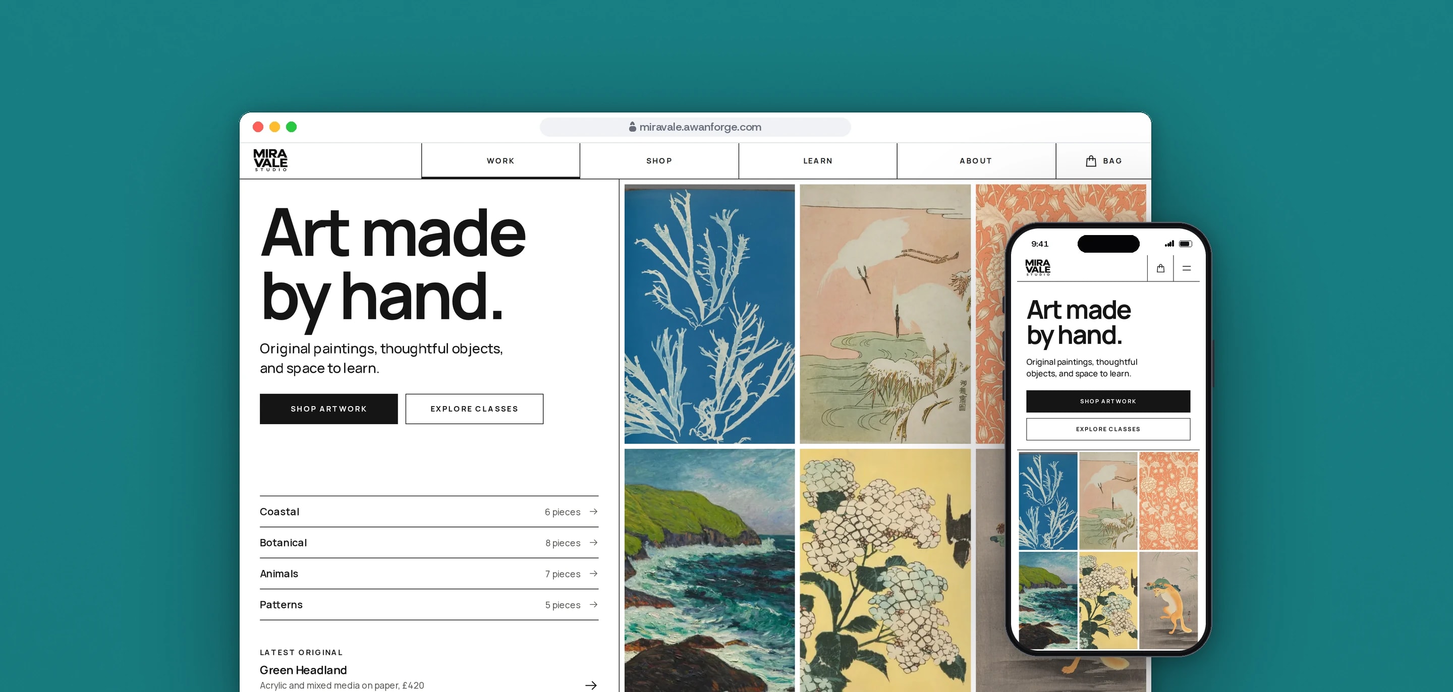
Our team designed and built Mira Vale Studio, an online shop for an artist’s original paintings, prints, handmade objects and classes. Every page is designed for the phone first, from the scrolling home page mosaic to the checkout.
- Client
- Own project
- Sector
- Art and craft retail
- Year
- 2026
- Platforms
- Web store, Mobile web
- Services
- Product and UX design, Web development
A complete shop for one artist: original paintings and numbered prints, handmade objects, and classes with dated sessions. It shows how a small studio’s own site could take orders and bookings, with the payment step built where a card form would go.
Built for
- Collectors buying an original painting or a print, often from a phone.
- People booking a place on a course or a workshop, or asking about a private lesson.
- An artist who wants orders and bookings to arrive without an email thread.
The problem
An artist who sells by email answers the same questions about availability, sizes and postage again and again, and a buyer who finds a piece late at night has to wait for a reply before they can pay for it.
One artist’s catalogue holds very different things: originals that sell once, prints in three sizes with a choice of frame, objects made to order and classes with a limited number of places. Each needs its own rules in the same bag.
The work is where the colour is. An interface with a palette of its own competes with the paintings, and scroll effects built for a desktop wheel often stutter on the phones most visitors use.
Goals
- 01Design one path from a painting, a print or an object to checkout, and one from a class to a booked date, with no email in between.
- 02Keep the interface black and white, so the colour on screen comes from the art.
- 03Make a sold piece impossible to add to the bag and an original impossible to add twice.
- 04Design every scroll effect for a phone first, with a calm version for visitors who reduce motion.
- 05Credit every image to its source and licence on a Credits page, and explain the sample content on the Terms and Privacy pages.
Our role
We created the studio and its sample catalogue, then designed and built the storefront as a complete example of an artist’s own shop.
What we delivered
- Identity in use: the Mira Vale wordmark, the MV symbol, a neutral palette and Manrope
- Home, shop, product, classes, about, bag, checkout and contact pages
- A square mosaic of the work, filtered by subject
- Shop filters for type, subject, price and availability, kept in the address
- Product pages with original, print size and frame options
- Bag, free delivery threshold and a checkout that lists every error at once
- Class booking by dated session, and an enquiry form for private lessons
- Terms, Privacy and Credits pages that name the source and licence of every image
How we worked
- 01
Let the art carry the colour
The interface is ink on white with hairline rules and one teal accent. The teal marks a sold piece, a focused control and a field that needs attention, so no other colour sits beside the paintings.
- 02
Choreograph the phone first
Every scroll effect was set at phone width before desktop layers were added. The pinned About scene runs only on screens 900px and wider, smooth scrolling only with a mouse or trackpad, and touch scrolling stays native.
- 03
One catalogue file behind every page
Titles, prices in pence, print sizes, frames, editions and stock live in one data file. The mosaic, the shop, the product pages, the bag and the checkout all read from it, so a price or a sold piece changes everywhere at once.
- 04
Build the payment step where it belongs
Checkout has its payment section where a card form would go, and it says that card payment is not connected and nothing is charged. The booking, contact and newsletter forms validate every field and then say on screen that nothing was booked or sent. A payment provider and a backend would fill those positions without a redesign.
Screens and features
Every piece on one wall, sorted by subject
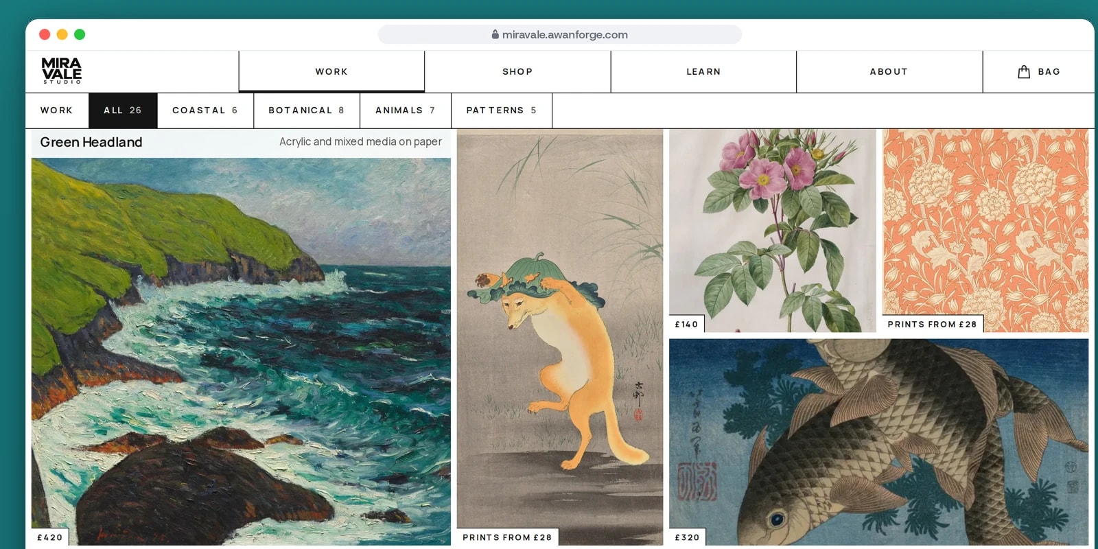
The home page opens into a mosaic of all 26 artworks. Coastal, botanical, animals and patterns filter it in place.
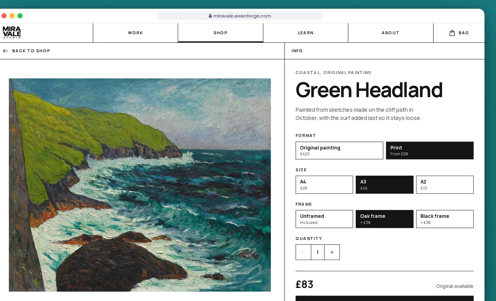
Prints priced as size and frame are chosen
Each artwork is offered as the original or as a print. The price and the button update with every choice.
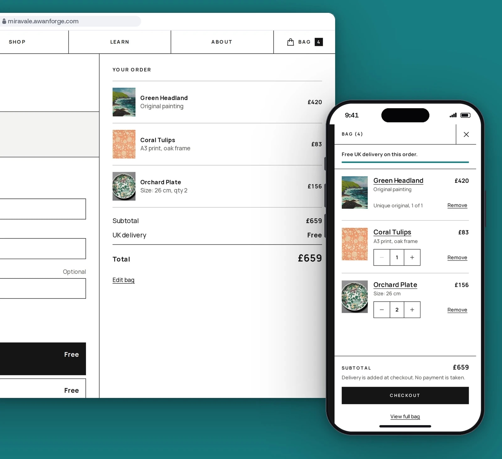
From the bag to checkout
The bag keeps only what was chosen. Titles, prices and stock are read again from the catalogue, so a sold piece cannot be bought.
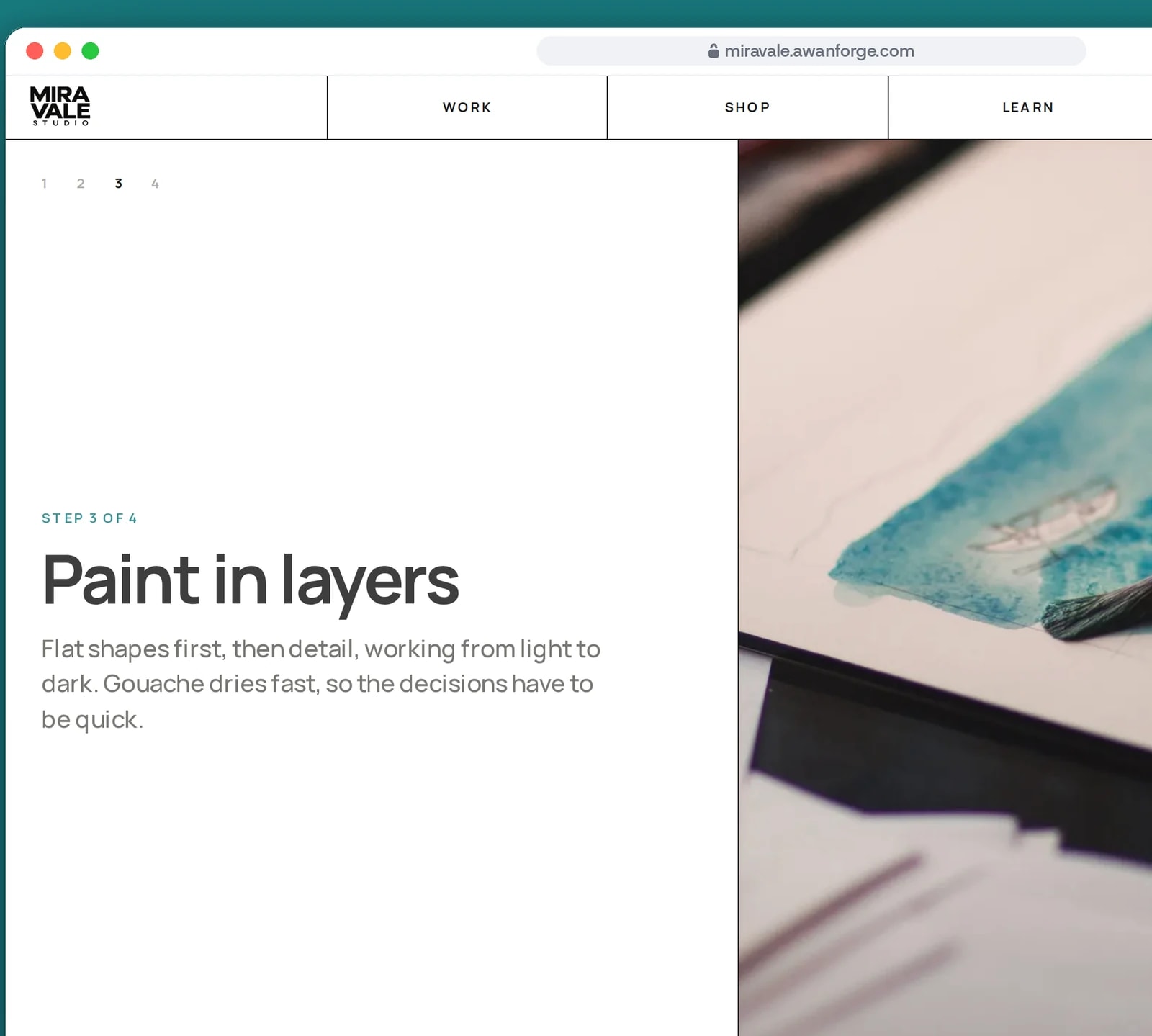
How the work is made, step by step
On the About page one scene holds still while four steps, from outdoor sketch to signed print, change as the page scrolls.


A hero that falls away
As the mosaic slides up over it, the opening panel sinks, shrinks to 92%, tilts by two degrees and fades, driven by the scroll position. On short screens or with reduced motion it simply scrolls away.
A square mosaic at every width
Container query units keep every cell square from two columns on a phone to five on a wide screen, with large, wide and tall tiles packed densely. Each tile shows its price at all times, and the subject filter is part of the address, so a filtered view can be shared.
From sketch to shelf
On the About page a GSAP ScrollTrigger scene pins four steps of the studio’s process and scrubs through them with the scroll: photographs crossfade, text slides and a progress bar fills. Phones and reduced motion get the same steps as a numbered list.
Artwork that travels to its page
Each artwork carries a named view transition, so its image morphs from the shop card into the product page gallery. The gallery can switch from the whole piece to a close detail of the brushwork.
Sheets built on the dialog element
The menu, the bag and the filters open in native dialogs, which keep focus inside and close on Escape. They slide and fade in CSS alone, using @starting-style.
A bag that cannot oversell
The bag stores only each item’s code and quantity, and re-reads the title, price and limits from the catalogue every time. A sold original drops out, and an original can be added once.
A buy button in reach on phones
On a product page, a bar with the price and the add button appears once the main button scrolls under the header, and steps aside when the footer arrives.
Technical choices
What the product is built with, and why.
- Next.js 16 with prerendered product pages
- Every product and class page is generated at build time with its own title and sharing image, and product pages carry product structured data, so each piece has an address that link previews can read.
- Motion for scroll-linked animation
- The falling hero and the mosaic entrances use Motion’s scroll and in-view hooks, under one setting that follows the visitor’s reduced motion preference.
- GSAP ScrollTrigger for the pinned scene
- The one pinned, scrubbed sequence uses GSAP’s media queries to run only on wide screens with motion allowed, and updates with the smooth scroll so the two never drift apart.
- Lenis for mouse and trackpad only
- Wheel smoothing switches on only for a fine pointer with hover and switches off with reduced motion. Touch input is left to the phone’s own momentum scrolling.
- Tailwind CSS 4 and Manrope through next/font
- Colours, type sizes and the mosaic grid are defined once in the stylesheet, and the typeface is served with the site rather than fetched from Google.
Mira Vale Studio is our own project. The artist, catalogue and prices are sample content, and the artwork images are public domain and openly licensed works credited on the site’s Credits page. Checkout, class booking and the forms show the complete flow without a payment provider or backend connected, so nothing is charged, booked or sent.
Selling your own art online?
We design shops where the work leads and orders arrive without an email thread. Tell us what you make.