IT’S POSSIBLE NOWRoutes into earning for disabled people, from a UK community interest company
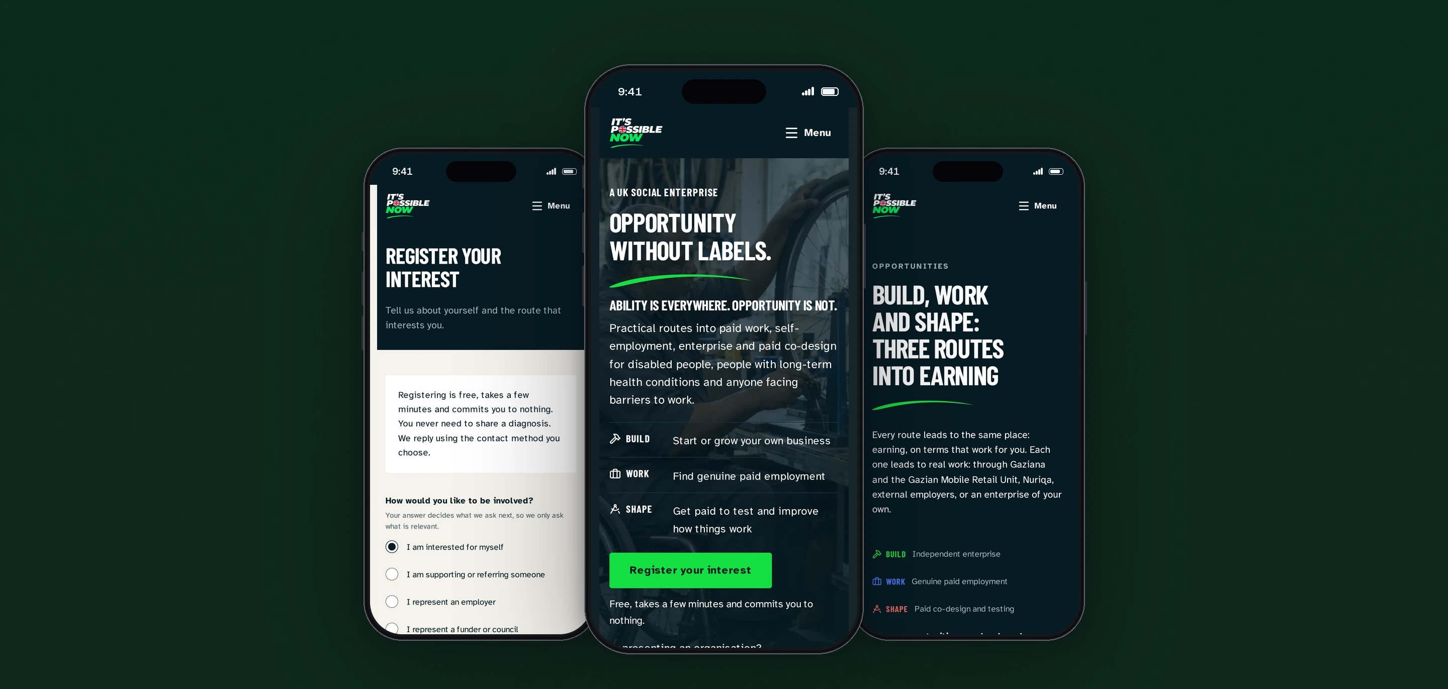
IT’S POSSIBLE NOW is a UK community interest company creating practical routes into paid work, self-employment, enterprise and paid co-design for disabled people and others facing barriers to work. We designed, built and deployed its website, ipncic.com, with accessibility and plain language written into the requirements.
- Client
- IT’S POSSIBLE NOW CIC
- Sector
- Social enterprise
- Year
- 2026
- Platforms
- Website, Mobile web
- Services
- Product and UX design, Web development
The public home of IT’S POSSIBLE NOW. It sets out three routes into earning, called Build, Work and Shape, walks a visitor through five steps from a first conversation to real work, and takes a registration of interest from people, from those who support them, and from organisations that want to take part.
Built for
- Disabled people, people with long-term health conditions and anyone facing barriers to work.
- Family members, support workers and referrers registering on someone’s behalf.
- Employers, funders, councils, venues and delivery partners.
- The IT’S POSSIBLE NOW team, who answer each registration by the contact method the person chose.
The problem
Many of the people this site is for have filled in forms that decided what they could not do. A registration page that reads like an application, or asks about a diagnosis, puts them straight back in that position.
The organisation speaks to two groups at once: people looking for a way into earning, and organisations that can fund, host, employ or partner. Each needs its own path through the site and its own questions on the form.
The audience includes people with a wide range of impairments, on whatever phone or computer they have. Accessibility is part of the brief from the first page, and the form has to work even when its JavaScript does not load.
Everything on the site has to be true on the day it is read. The organisation is new, so no outcome, partner or figure appears until it has been supplied.
Goals
- 01State the three routes into earning in plain words on the first screen.
- 02Keep registering small: free, a few minutes, no diagnosis and no commitment.
- 03Give employers, funders and partners their own way in, with the right questions for each.
- 04Target WCAG 2.2 Level AA on every page, and publish an accessibility statement that says how it was tested.
- 05Publish only what is true, and label illustrative people as illustrative.
Our role
We designed, built and deployed the site, and we run its release pipeline.
What we delivered
- Site structure and content design from the client’s brief
- Visual design, with a colour system checked for contrast
- Next.js build, prerendered, with no database
- Register Interest form with branching questions and server-side validation
- Enquiry email to the team over the organisation’s mail relay
- Share cards, sitemap and search metadata for every page
- Accessibility statement and privacy pages
- CI/CD to a Linux server with release switching and automatic rollback
How we worked
- 01
Work from the brief, word for word
Where the client’s brief gave exact wording, the site uses it as given, and lists keep the brief’s order. Text shared by several pages lives in one file, so Home, How it works, Partners and About say the same thing.
- 02
Design the form around what it never asks
The form has no field for a diagnosis or a health condition, required or optional. The code that defines the fields says so, and treats adding one as a change of policy.
- 03
Turn the easy mistakes into build failures
Scripts check contrast, page metadata and search indexing on every build. The metadata check was added after pages had shipped sharing the home page’s title and image, which no type check or lint rule had caught.
- 04
Release through a pipeline that can undo itself
Each push to main is verified, built and unpacked into a new release on the server. If the live smoke test fails, the pipeline switches back to the previous release and still reports the run as failed.
Screens and features
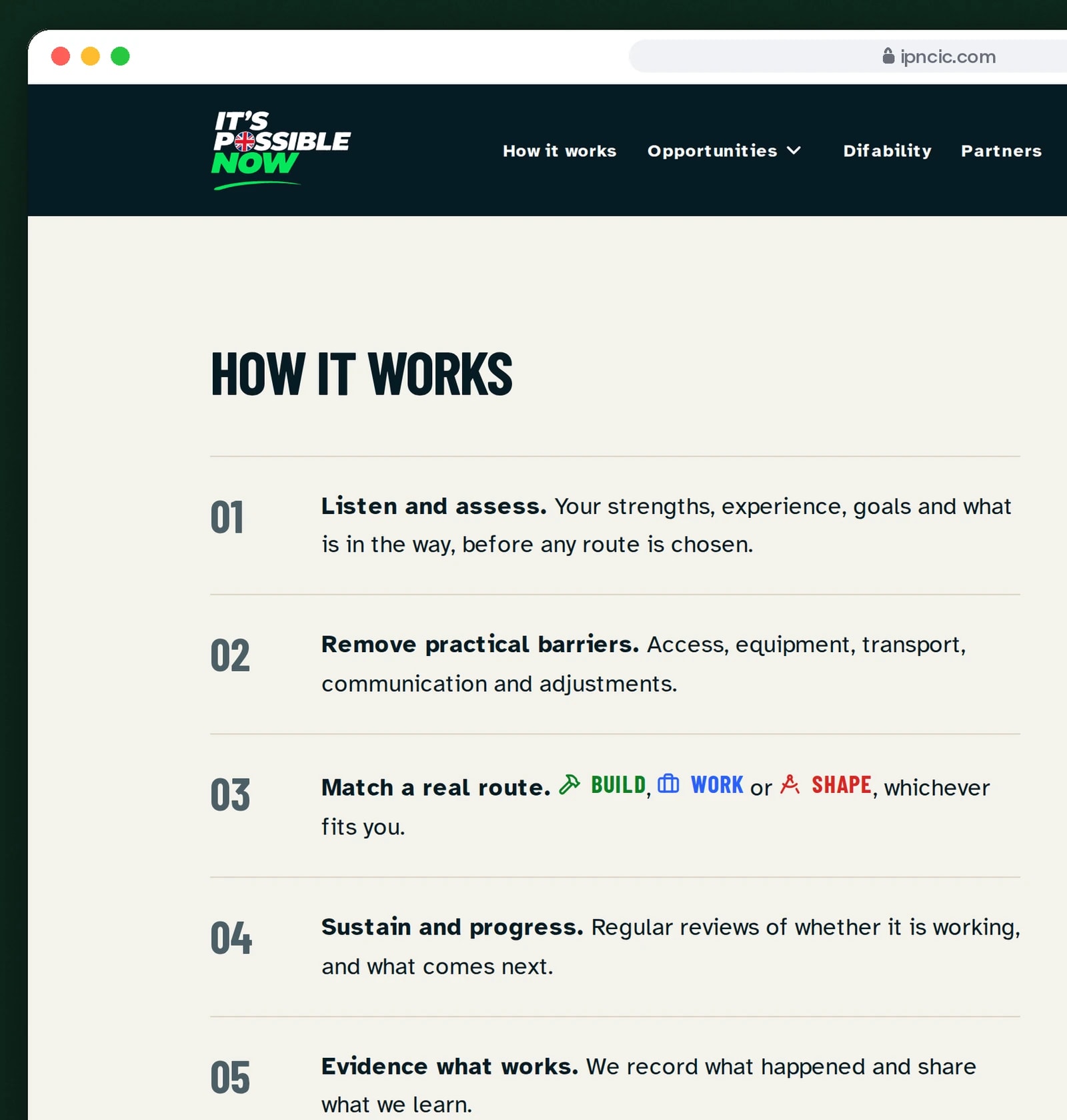
Five steps from first conversation to work
Visitors see the whole route before they register. Registering takes a few minutes and commits them to nothing.
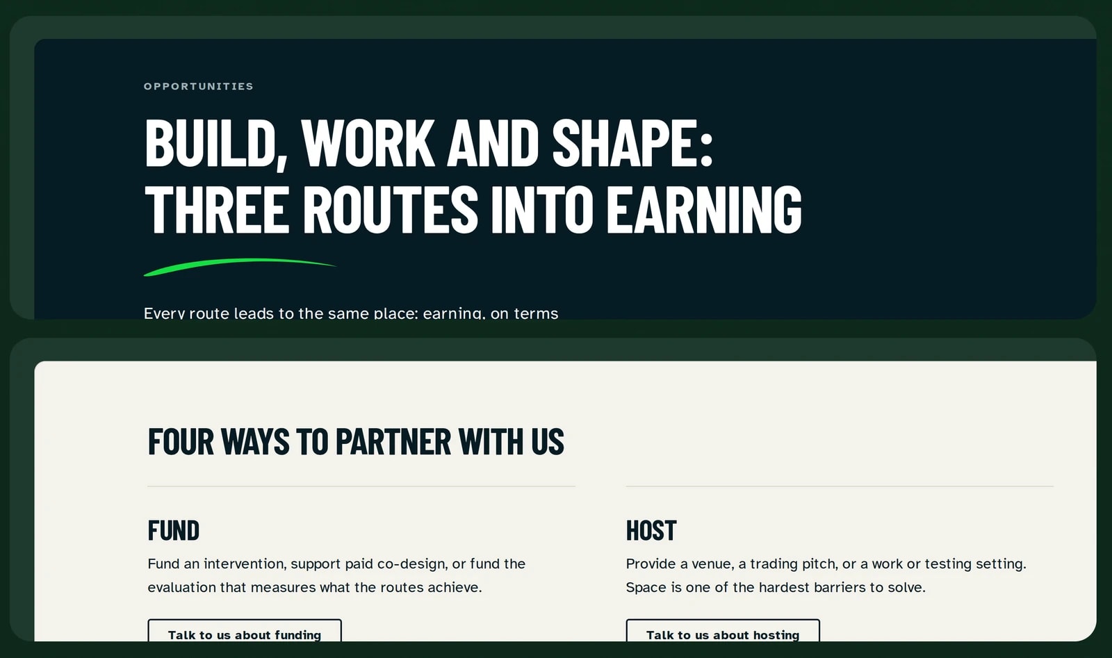
Three routes in, and one for partners
Build, work and shape are explained in plain words. Organisations get a route of their own.
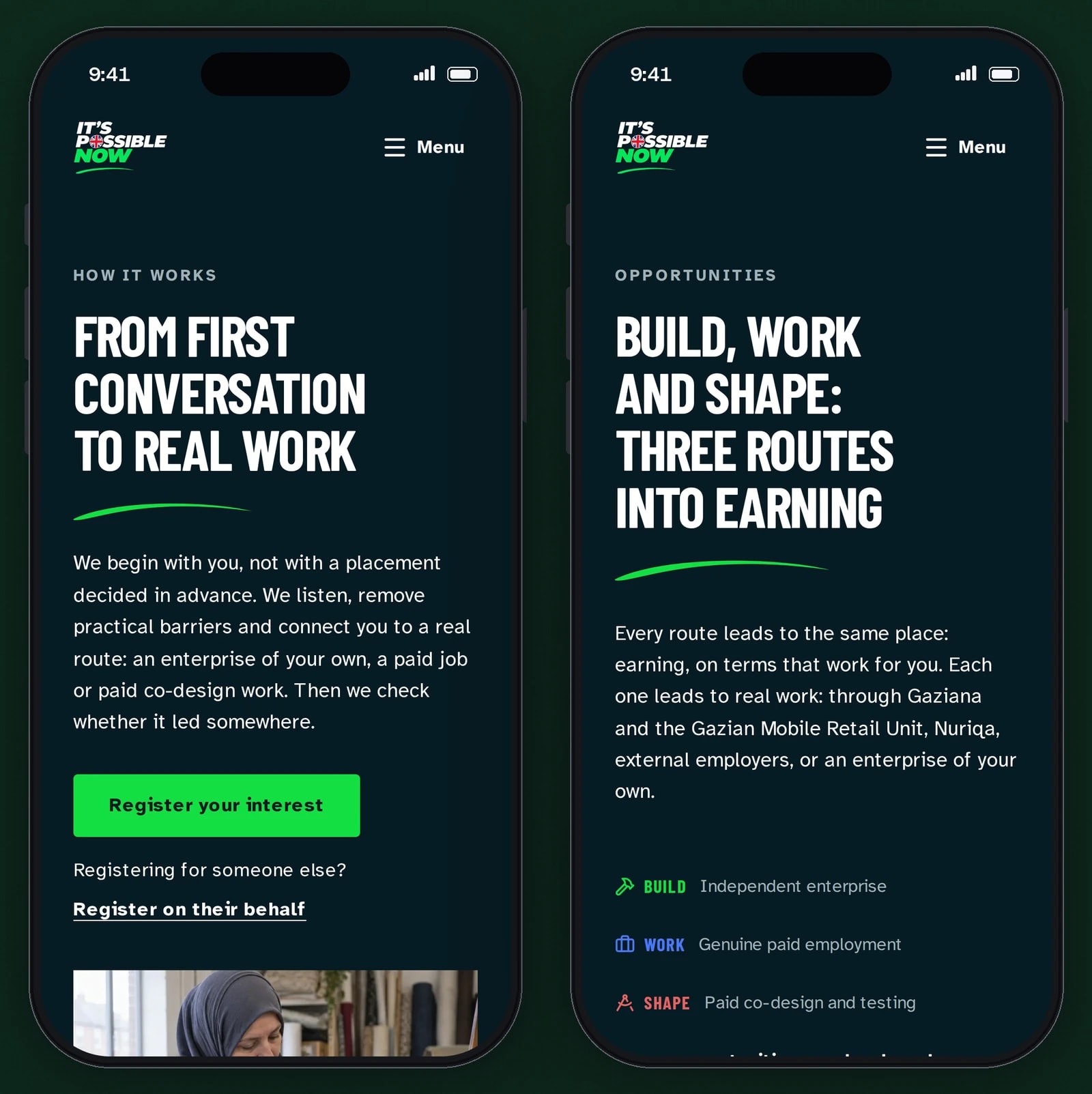
Built for the phone first
Most visitors arrive on a phone, so every page reads in one column, with large type and a single clear next step.


Branching that works without JavaScript
Which follow-up questions appear is decided in CSS by the chosen answer, so a visitor whose JavaScript fails can still complete the form.
One set of validation rules
The server checks every submission and returns all the errors together. The summary lists them in page order, links each one to its field and takes focus, so a screen reader announces it.
No question about health
The page says before the first field that nobody needs to share a diagnosis, and the form has nowhere to enter one.
Links that land on the right answer
Other pages link into the form with an answer preselected. Close variants of an answer in a link are accepted, and anything unrecognised leaves the form unselected.
Spam protection with nothing to solve
A hidden field, a minimum time to fill the form and a limit of five sends per IP address in ten minutes stop automated submissions without a puzzle for the visitor.
Route colours that pass contrast
The bright route colours are used as fills, and each has a darker text variant for light backgrounds. A build check rejects the bright hues when they are used as text.
A film with captions and a transcript
The client’s concept film loads nothing until it is played, has open captions, a closed-caption track and a transcript, and a line stating that the people in it are illustrative.
Technical choices
What the product is built with, and why.
- Next.js 16 with no database
- The site is content and one form. Pages are prerendered, and a server action validates each registration and emails it to the team, so there is no store of personal details to secure or back up.
- Zod on the server only
- Validation rules run on the server, and the browser downloads none of them. Moving the form’s option lists into a file without Zod took 90KB gzipped off the contact page.
- SMTP with STARTTLS required
- Registrations go to the team through the organisation’s mail relay on port 587, and the code refuses to send over a connection that has not been encrypted.
- GitHub Actions to a standalone build behind nginx
- Each release gets its own directory on the server and goes live by switching a symlink. The previous release stays in place, so a rollback is one switch and a restart.
Building a service for people facing barriers?
Accessible forms, plain language and copy that stays true are work we take seriously. Tell us who your site is for.