DeskpetalA shared inbox landing page with an inbox to try
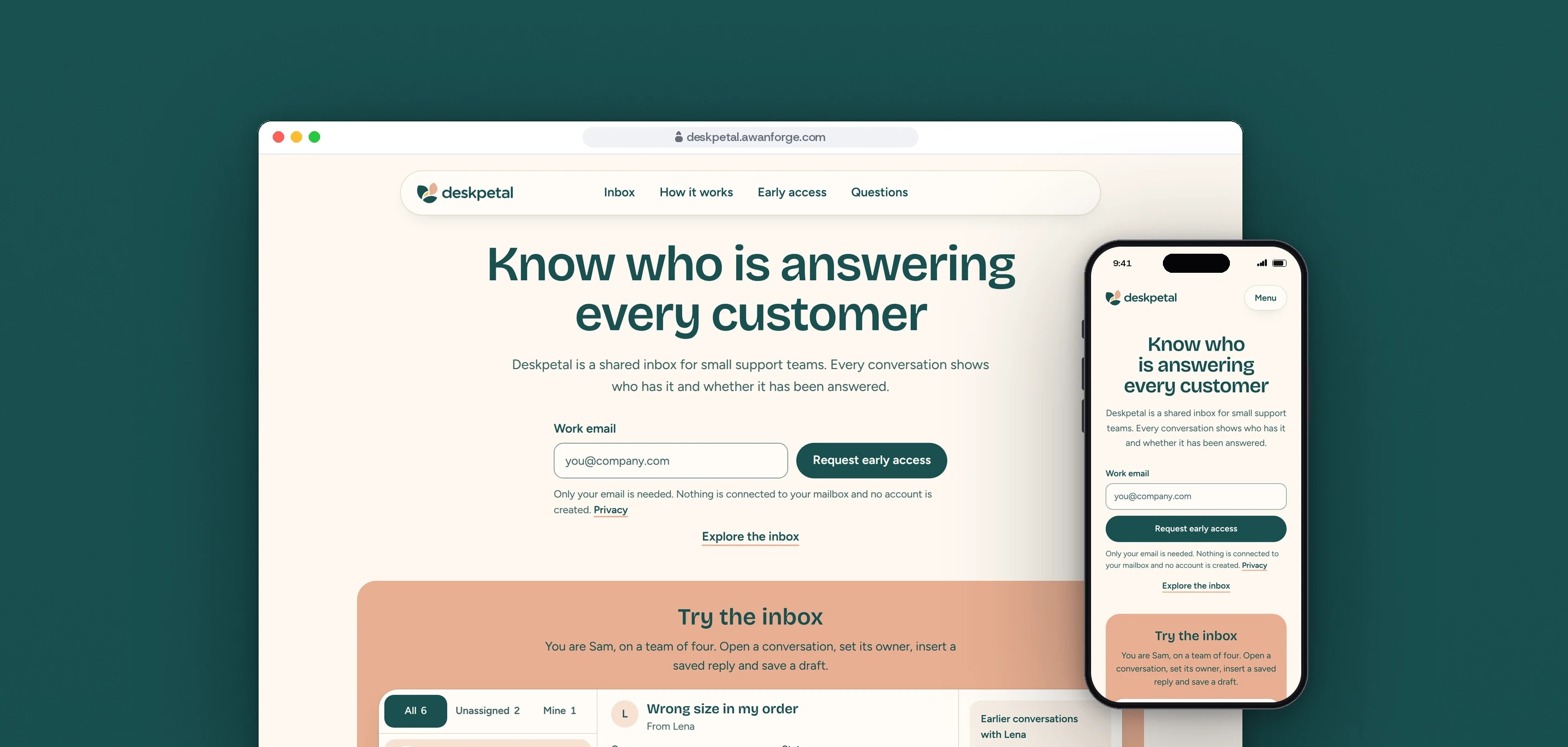
Deskpetal is one of our own products, at the landing-page stage: a shared inbox for small customer-support teams. We designed and built a calm, centred page with the early access field in the first screen and a working inbox below it, where the visitor assigns a conversation, inserts a saved reply and saves a draft.
- Client
- Own product
- Sector
- Customer support
- Year
- 2026
- Platforms
- Website
- Services
- Product and UX design, Web development, Brand and graphics
A landing page for a small company where everyone answers customers from one shared email login. It shows an inbox in which every conversation has one person on it and one status, and asks for nothing more than a work email to request early access.
Built for
- Founders and first support hires in companies of 2 to 15 people.
- Small teams who have looked at help desks and found them built for much larger support departments.
The problem
Two people answer the same customer with different replies, and another message waits four days because each thought the other had it. In a shared login, read or unread is the only signal.
The first worry for this buyer is their email. The page could promise nothing about connecting a mailbox, so it had to say plainly, before and after the form, that nothing is connected and no account is created.
A support inbox needs room. The page had to keep the inbox usable from a 390 px phone to a wide desktop without becoming a small help desk.
Goals
- 01Put the email field and Request early access in the first screen, with the top of the inbox in view.
- 02Show who has each conversation and whether it needs a reply, on every row.
- 03Let the visitor assign a conversation, insert a saved reply, edit it and save a draft, with no Send button that pretends to deliver.
- 04Warn in the reply box when a teammate is already writing.
- 05Make the hero field and the full form one request, so an address typed above is carried below.
- 06Keep one primary action in view at a time, on desktop and on a phone.
Our role
We wrote the page, set its design system, rebuilt the logo as a vector system from approved artwork, built the inbox and both request forms, and released it on our own server.
What we delivered
- A section order that pairs each failure of a shared login with the inbox state that prevents it
- A design system: colour tokens with measured contrast, Bricolage Grotesque and Figtree, radii from 14 to 28 px, short teal shadows
- The logo rebuilt as a vector system from approved artwork: lockup, mark, wordmark, reversed and one-colour versions, a small-size favicon drawing and a sharing image
- A working inbox of six sample conversations in one, two or three panes
- An early access field in the hero and a full form further down, sharing one request
- A privacy page, a contact page, a branded 404 and a menu sheet for phones
- Lead storage and the signed-in lead list shared with the two sibling pages, testing and the release
How we worked
- 01
Centred, rounded and calm
A cream page, dark teal for text and the primary action, soft peach for warmth and selection. Corners run from 14 px on fields to 28 px on the inbox frame, and status chips and the primary button are full pills.
- 02
Yellow means one thing
The yellow dot marks Needs reply and nothing else. It is too light to stand alone, so it always sits beside the words and inside a teal outline.
- 03
The interface is the image
There are no photographs, people or illustrations. The inbox is HTML and CSS with initials on colour, and three small line icons are the only drawings.
- 04
Three moments, three states
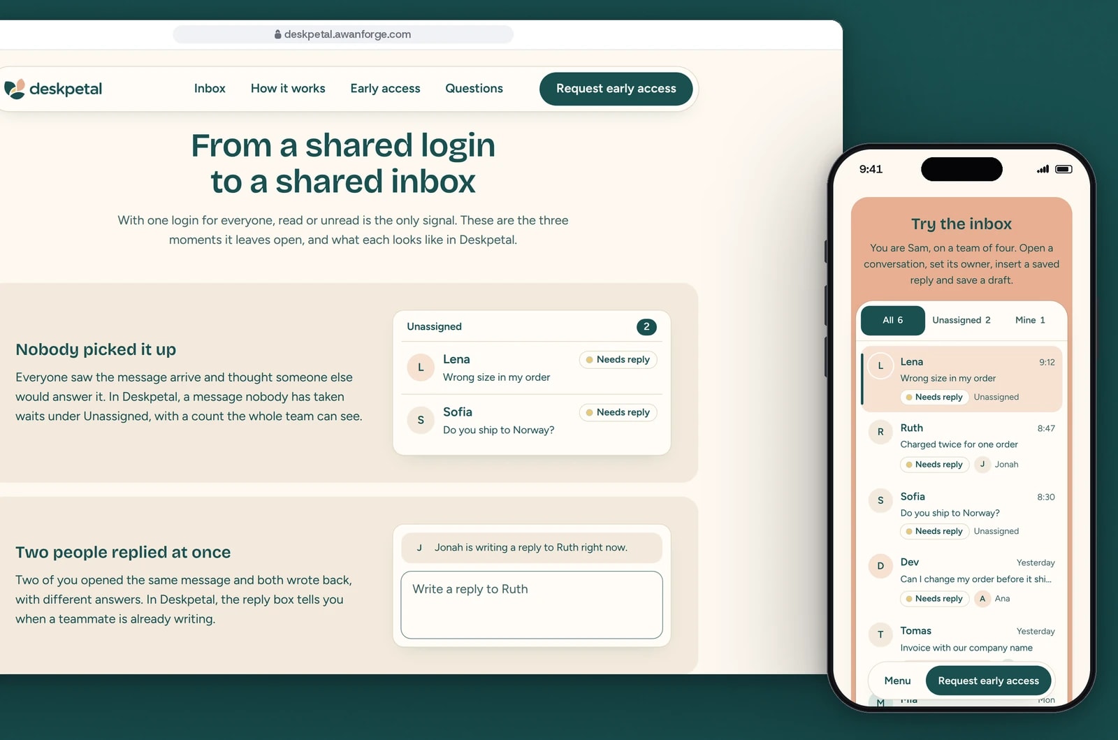
Below the inbox, each failure of a shared login sits beside the state that prevents it: a message nobody picked up in an Unassigned list, two people replying at once with a note in the reply box, and a message that looked handled with the teammate on it and its status.
- 05
The visitor has a name
The inbox introduction says “You are Sam, on a team of four”, so Sam (you) in the list of teammates and You on a row need no explanation.
Screens and features
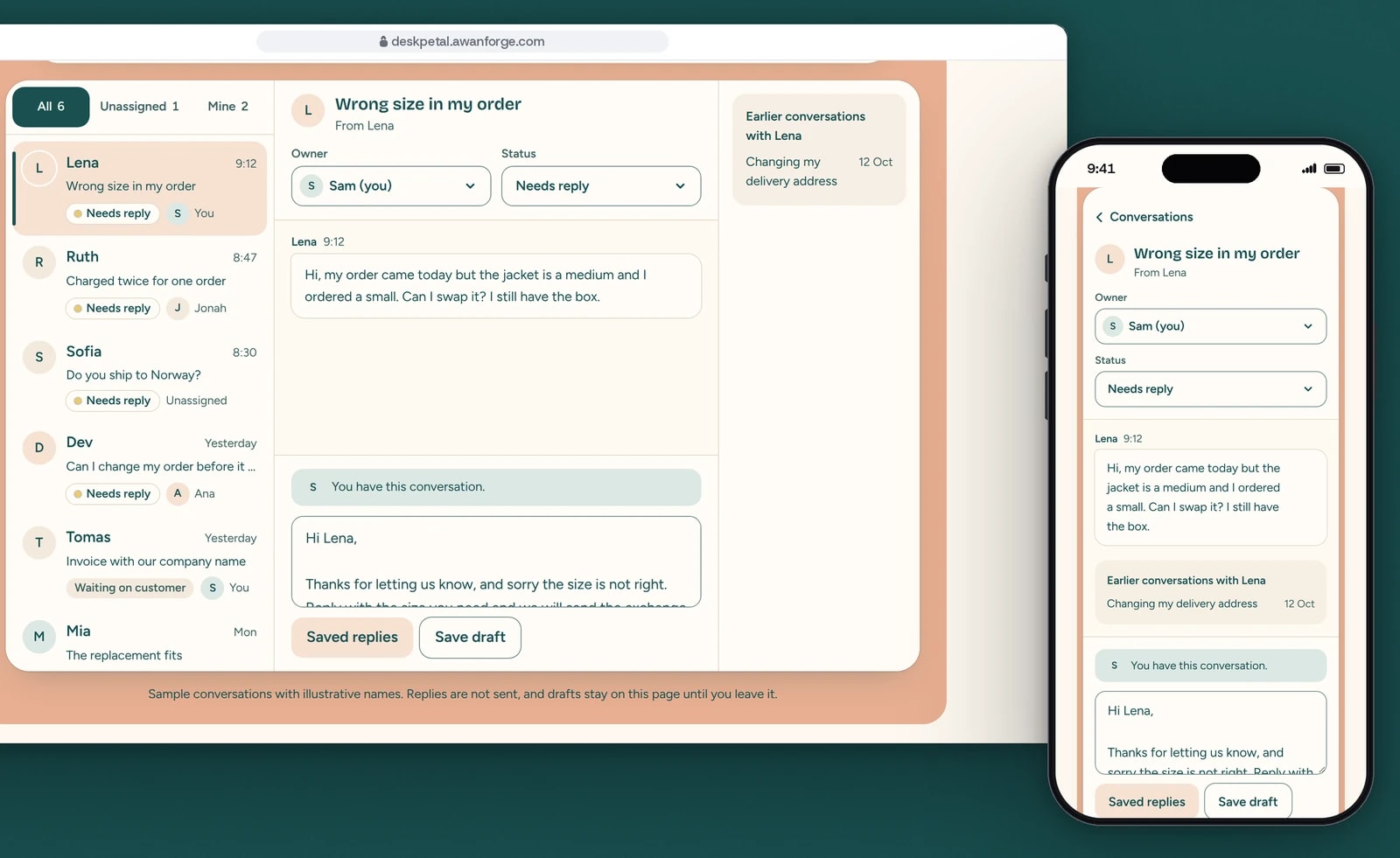
Assigned, then a saved reply
Assigning a conversation takes it out of Unassigned. A saved reply drops into the reply box, ready to edit before it is saved as a draft.
Three moments a shared login misses
A message nobody picked up, two people replying at once, and one that looked handled. Each is shown as the inbox state that prevents it.
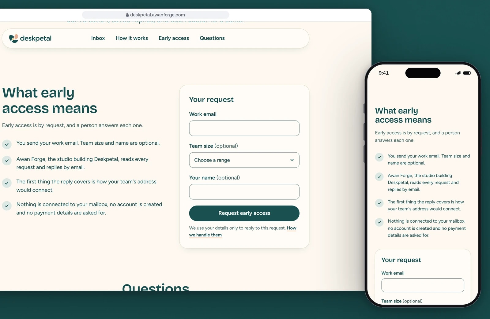
Early access by request
A work email is all the request needs. The steps beside the form say that nothing is connected to a mailbox and a person replies.


Who has it, on every row
Each conversation shows its status and the teammate on it, or Unassigned. Filters for All, Unassigned and Mine carry counts that change as conversations are assigned.
A note before a double reply
When a teammate already has the conversation, the reply box says who is writing, so a second answer is not started by accident.
Saved replies that stay editable
A saved reply previews line by line, then drops into the reply box with the caret at the end and the greeting in view. Save draft keeps it on the page; there is no Send action.
The customer’s history beside the reply
Earlier conversations with the same customer sit next to the thread from 1280 px, and inside it on narrower screens.
A phone inbox with a real back step
On a phone the list comes first and a conversation opens as a pushed view with its own history entry, so both the Conversations control and the browser’s Back button return to the list.
One request in two places
An address typed into the hero is carried to the full form, and the hero can send on its own. Success, a repeat request and errors show in both places.
Technical choices
What the product is built with, and why.
- One Next.js 16 app, three hostnames
- Deskpetal is served by the same app as Briefspan and Shiftcrest, chosen by hostname, with its own layout, components and a stylesheet that defines only its own colours.
- Breakpoints set by what the inbox needs
- The thread needs about 26rem to show the teammate and status side by side, so the list and thread sit together from 768 px. A third column for the customer’s history needs 1280 px.
- Bricolage Grotesque and Figtree, served from the site
- Both load from the site’s own files with size-adjusted fallbacks, so the swap does not move the layout. Controls inherit the font settings explicitly, because the browser resets them otherwise.
- Motion only on transform and opacity
- Messages rise 8 px as a conversation opens and an assigned avatar settles with one small overshoot. Nothing runs on scroll, and with reduced motion every movement becomes a short fade.
- SQLite for early access requests
- Both forms post to the same endpoint, which stores a request once, answers a repeat as already received and limits requests per address. Requests are read in a signed-in area with a password and an authenticator code.
- Playwright in three browser engines
- The inbox is tested by pointer and keyboard in Chromium, Firefox and WebKit, including the phone pushed view and the browser Back button, with axe checking the inbox in its open states.
Outcomes
374 automated checks passing in three browsers
The final run across the three products passed 374 checks with none failing or skipped, among them assigning and filtering, inserting a saved reply and saving a draft, the phone pushed view, both forms in every state, and accessibility at 390 and 1440 px.
Evidence: the project’s QA record of 11 November 2026, run on the production build in Chromium, Firefox and WebKit.
Lighthouse 98 to 99 on a simulated phone
On Lighthouse’s simulated slow 4G phone the page scored 98 to 99 for performance, with the largest element on screen in 2.0 to 2.3 s and no layout shift.
Evidence: Lighthouse 13 lab runs recorded in the project’s QA record of 11 November 2026. These are lab measurements; no visitor data is behind them.
Deskpetal is an Awan Forge product at the landing-page stage. The inbox on the page runs in the visitor’s browser on illustrative conversations: replies are not sent, and drafts stay on the page until the visitor leaves it. Nothing connects to a mailbox and no account is created; the early access form stores real requests, and a person at Awan Forge replies by email. The logo was rebuilt as a vector system from approved artwork.
Want visitors to use the product before they sign up?
We build landing pages with a working part of the product on the page, plain words about what exists today and a form that stores every request. Tell us what you are building.