debugstoriesA technical blog where each article follows one real bug to its fix
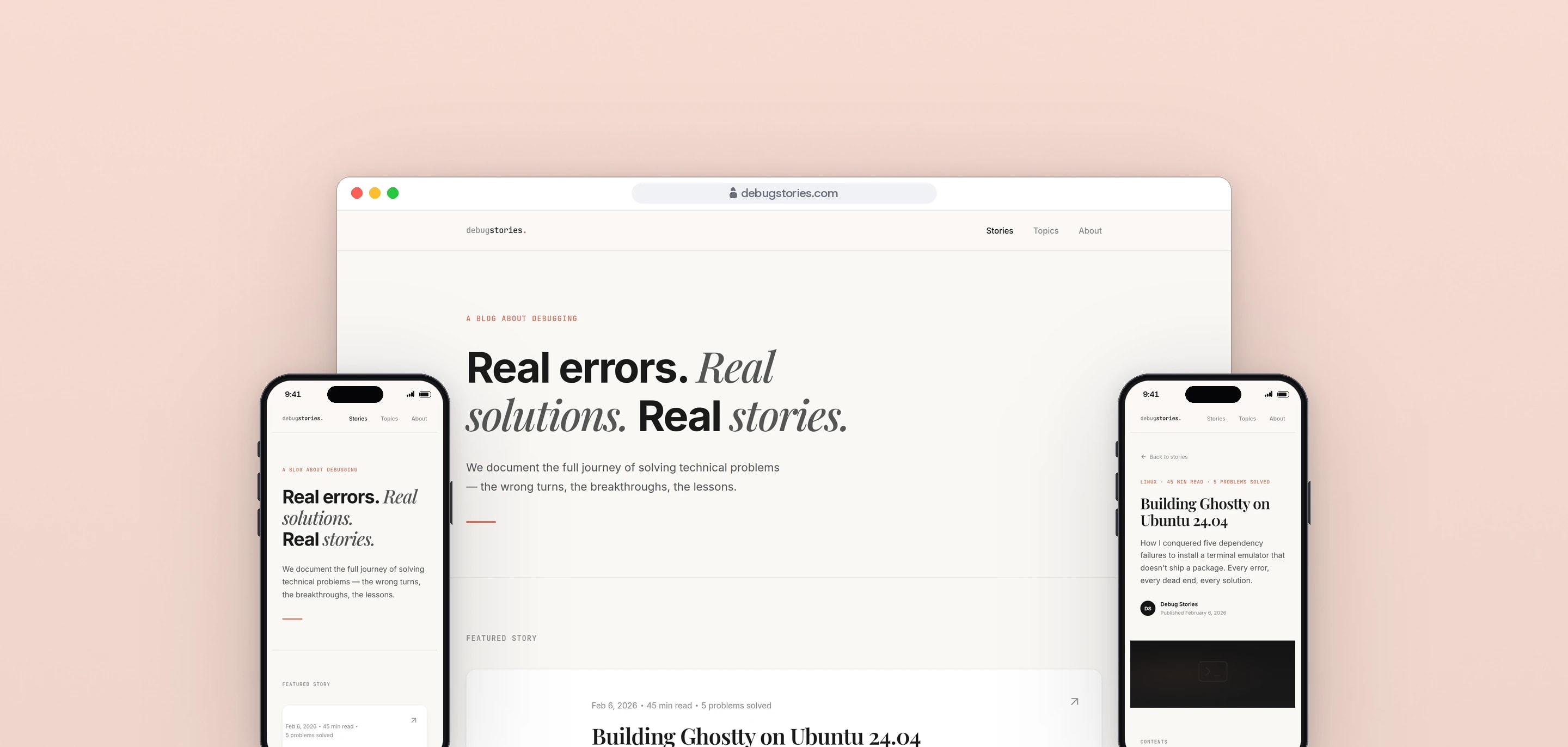
debugstories is a blog of debugging stories: each article follows one real problem from the first error message to the working fix, wrong turns included. We did the site design and build, and wrote the editorial guides the articles follow.
- Client
- Own publication
- Sector
- Technical publishing
- Year
- 2026
- Platforms
- Website, Mobile web
- Services
- Product and UX design, Web development
A place to publish debugging work as it actually happened: the setup, each error in full, what it meant, what was tried and what finally worked, with the commands collected at the top for readers in a hurry.
Built for
- Developers who have hit the same error and searched for it.
- Readers who want the reasoning behind a fix, not only the command.
The problem
Most tutorials show the clean path: the commands that worked, in order. A reader who hits a different error on step three finds nothing, because the dead ends were edited out.
A real debugging story is long. The Ghostty article covers five separate problems and a 45 minute read, so the page has to give the reader a way through it, and a way to skip straight to the commands.
Error output is wide, and trimming it loses the detail a reader is searching for. It still has to be readable on a phone.
Goals
- 01Tell each fix as a story, with the wrong turns kept in.
- 02Put the working commands at the top for readers who only want those.
- 03Keep long articles easy to move through on any screen.
- 04Show real error output in full, on phones too.
- 05Give every article the same structure, so writing the next one is repeatable.
Our role
We did the site design and build, and set up the editorial process behind it.
What we delivered
- Site design and build in plain HTML and CSS, with no framework and no build step
- Home page with a featured story and a numbered story list
- Article layout with contents, pull quotes, code blocks, lessons and a quick reference
- Responsive layout from phone to desktop, with a skip link and reduced-motion support
- Brand voice, taglines, an article template and a writing style guide
- A five-draft writing process with a target score for each draft
How we worked
- 01
Study the references
The design started from a scored review of reference sites, which set the direction: type-led headlines, a warm neutral page and a single accent colour.
- 02
Build the article around the story
Each article runs the same way: the story, the commands in brief, the starting point, then every problem as the attempt, the error, what was actually happening and the solution, ending with lessons and a quick reference.
- 03
Write the process down
A brand guide, a style guide and an article template fix the voice and the structure. Articles go through five drafts, each with a target score, before they are ready.
- 04
Check every command
Sixteen article sources are in the repository, and fifteen of them carry a list of the commands that were run and checked for that story.
Screens and features
Long reads with a clear path through them
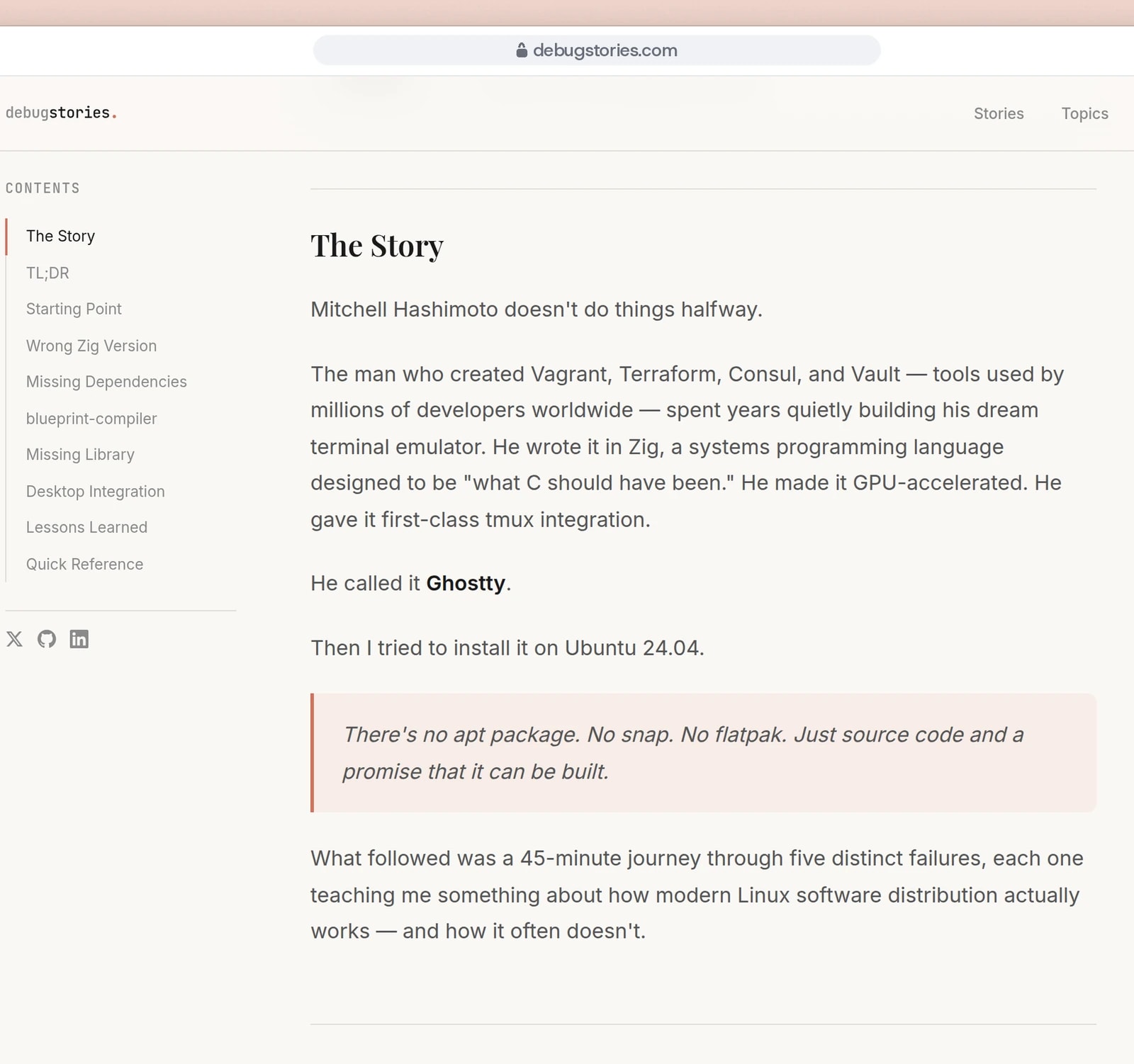
Each article has a contents sidebar, pull quotes and a serif title set for reading.
Every problem shows the attempt, the error and the fix
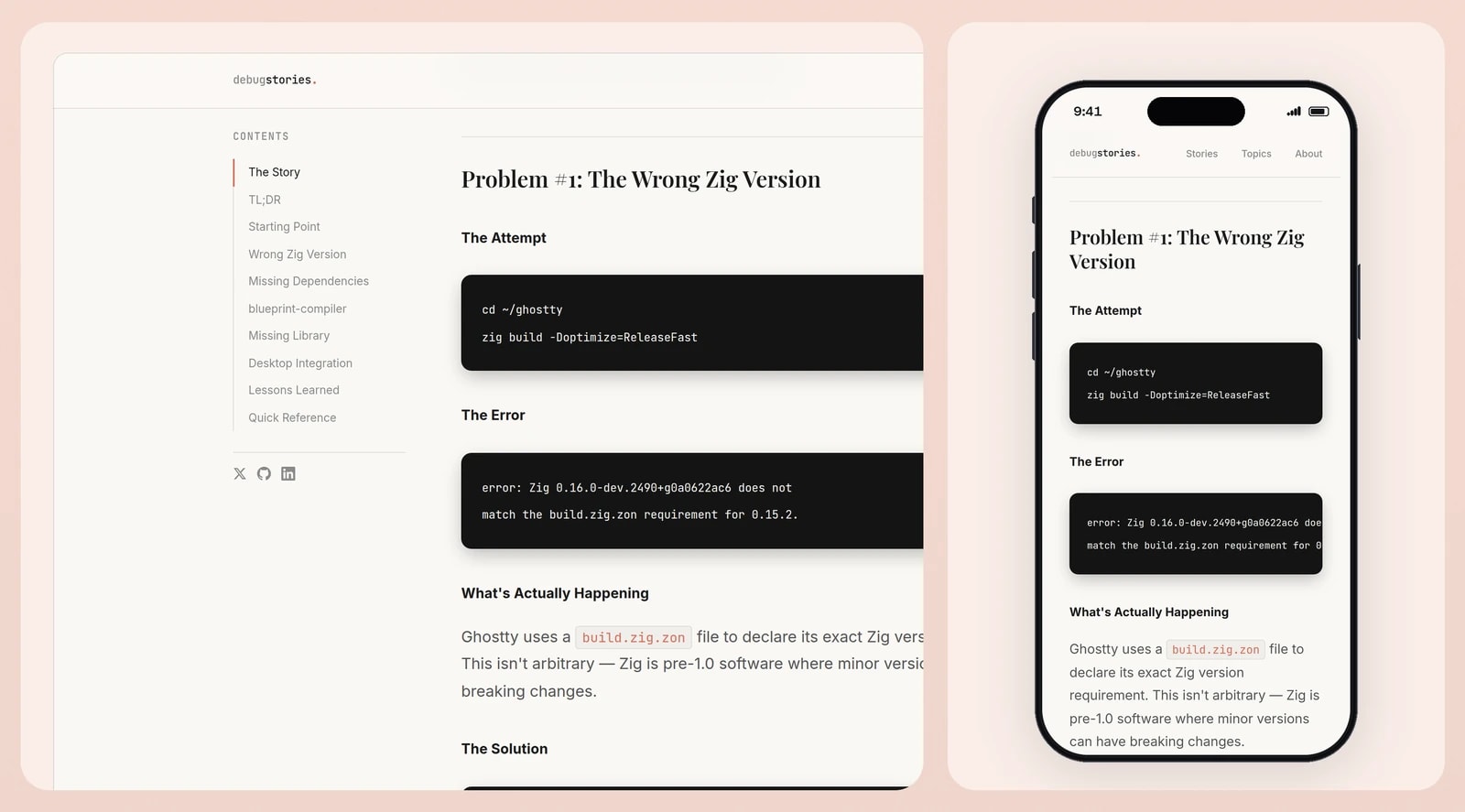
Code blocks keep their own scroll on a phone, so the page never scrolls sideways.


Attempt, error, explanation, fix
Every problem in an article is set out the same way, so a reader can scan for the error they have and read only that part.
The commands up front
A short section near the top lists the working commands for readers who want the fix and nothing else.
Contents that stay in view
On wide screens the contents list sits beside the article and stays on screen while it scrolls. On a phone it sits at the top of the article.
Three typefaces, three jobs
Playfair Display for headlines, Inter for reading and JetBrains Mono for code and terminal output.
Lessons and a quick reference
Each article ends with numbered lessons and a table of every problem and its solution.
Technical choices
What the product is built with, and why.
- Plain HTML and CSS
- The site is two pages and one stylesheet of about 860 lines. There is nothing to compile, so what is in the repository is exactly what the browser renders.
- Code blocks that scroll on their own
- The blog's rule is to show real error messages, not simplified versions, so long lines cannot be shortened. Each block scrolls sideways inside its own box instead of widening the page.
- A sticky contents list from 1024 pixels
- Articles run to three quarters of an hour. Above that width there is room for the list beside the text, and below it the list moves to the top of the article.
- Motion that respects the reader's settings
- Animations, transitions and smooth scrolling are switched off for readers who ask their system for reduced motion, and a skip link takes keyboard users straight to the content.
Publishing long technical writing?
Reading layouts, code on small screens and an editorial process that holds up are all part of the work. Tell us what you publish.