BriefspanA creative review landing page with a review that works on the page
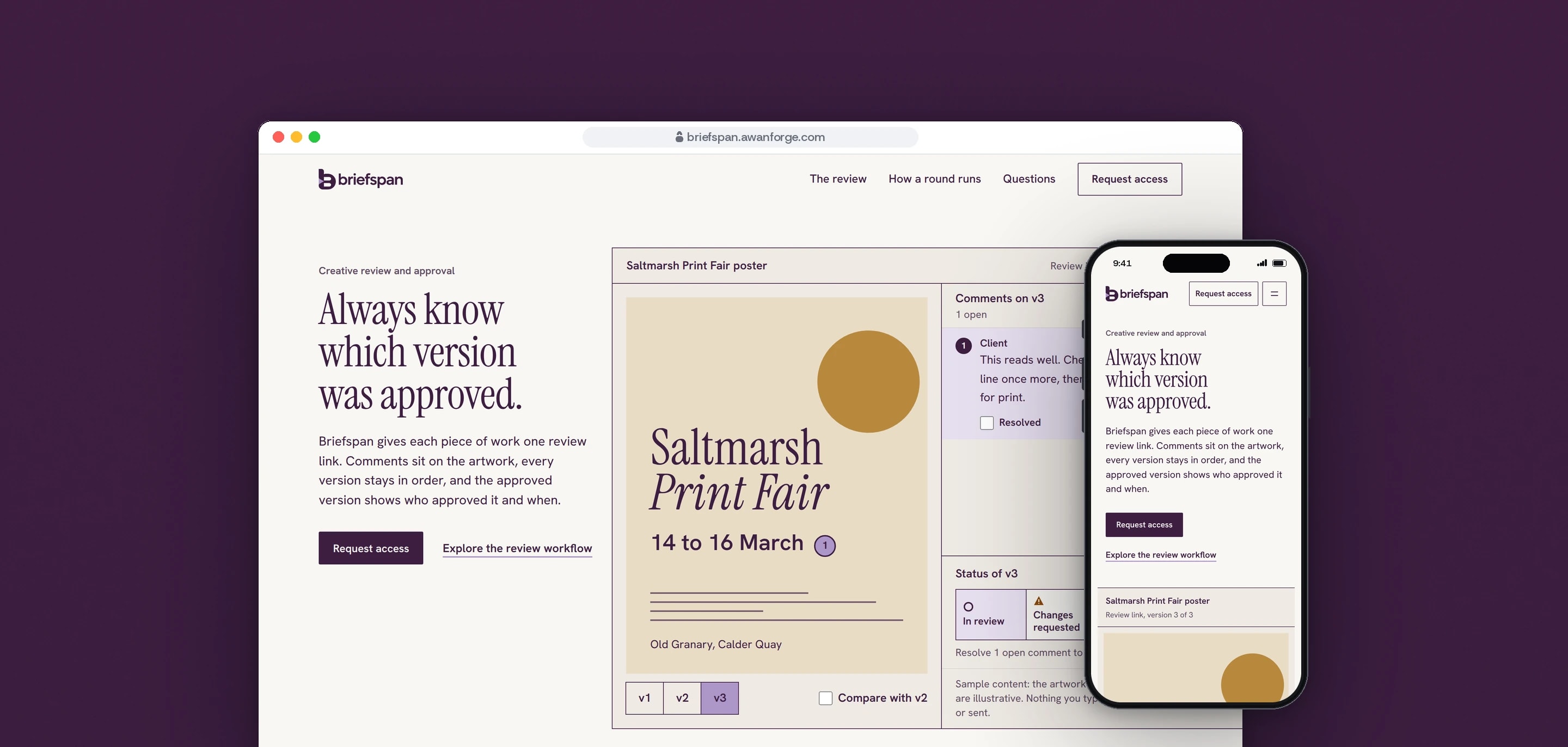
Briefspan is one of our own products, at the landing-page stage: creative review and approval for small studios and in-house marketing teams. We designed and built the page around a working review of a sample poster, with pinned comments, three versions to compare and an approval that is recorded, and a request form that stores real requests for access.
- Client
- Own product
- Sector
- Creative review and approval
- Year
- 2026
- Platforms
- Website
- Services
- Product and UX design, Web development, Brand and graphics
A landing page that has to answer one question for a studio lead: is this clearly better than a shared folder and email, and would the people approving the work cope with it? The page hands the visitor a review to use, then asks for a work email.
Built for
- Creative leads and producers in teams of 3 to 20 who send work out for sign-off and chase the answer.
- In-house marketing teams collecting approval from several colleagues on one piece of work.
- The people who approve the work, who open a review link and comment or approve there.
The problem
Feedback on creative work arrives by email, in chat and on calls. A folder fills with copies, “final” stops meaning final, and nobody can say for certain which version was signed off.
Briefspan is at the landing-page stage, with no customers, prices or results to show. The page had to persuade with the product itself, and say exactly what a request gets today.
It also had to look like nothing else on the same server. Shiftcrest and Deskpetal were built at the same time from the same app, and each needed its own voice.
Goals
- 01Name the category, the buyer and the result in the first screen, with one primary action.
- 02Put a working review in the hero: pins on the artwork, versions, a compare view and an approval state.
- 03Show the record of who approved which version, the answer the buyer is missing.
- 04Ask for a work email and nothing more, and say before and after the form that no account is created.
- 05State no price, integration, file type or customer that does not exist.
- 06Meet WCAG 2.2 AA and work by keyboard, including the review.
Our role
We researched the buyer, wrote the page, set its design system, rebuilt the logo as a vector system from approved artwork, built the review and the request flow, and released it on our own server.
What we delivered
- Research shared with the two sibling pages: ten live reference pages inspected at 1440 and 390 px, published buyer language and conversion guidance, each finding labelled by kind
- A section order taken from the buyer’s objections, with every claim checked against what the page can show
- A design system: colour tokens with measured contrast, two typefaces, a 12-column grid and a motion table
- The logo rebuilt as a vector system from approved artwork: lockup, mark, wordmark, reversed and one-colour versions, favicons and a sharing image
- A working review of a sample poster in three versions, drawn in SVG and HTML
- A request form, a privacy page, a contact page and a branded 404
- Lead storage, rate limits and a signed-in lead list shared with the two sibling pages
- Accessibility, layout and browser testing, and the release
How we worked
- 01
The tool is the hero image
A narrow text column sits on the left and the review runs off the right edge of the window. The poster, pins and versions in it are live controls, so the first screen already shows what Briefspan does.
- 02
Sections in the order of the doubts
After the review comes the record of what was approved, then the same approval handled with a folder and email beside the review link, then how a round runs, then the request. Each section answers the next question a studio lead asks.
- 03
An editorial page, not a dashboard
Porcelain paper, plum ink and one lilac accent. Instrument Serif sets the statements and Hanken Grotesk the tool. Hairline rules replace cards, corners are square, and there are no photographs.
- 04
Status that does not rely on colour
In review, Changes requested and Approved each have a shape and a word: a hollow circle, a triangle and a square with a tick. The status text reaches 5.4:1 or more on every ground it sits on.
- 05
Plain about the stage
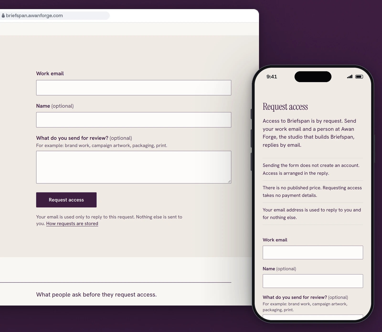
Beside the form the page says that access is by request, a person at Awan Forge replies by email, sending the form creates no account, and there is no published price.
Screens and features
Comments pinned to the artwork
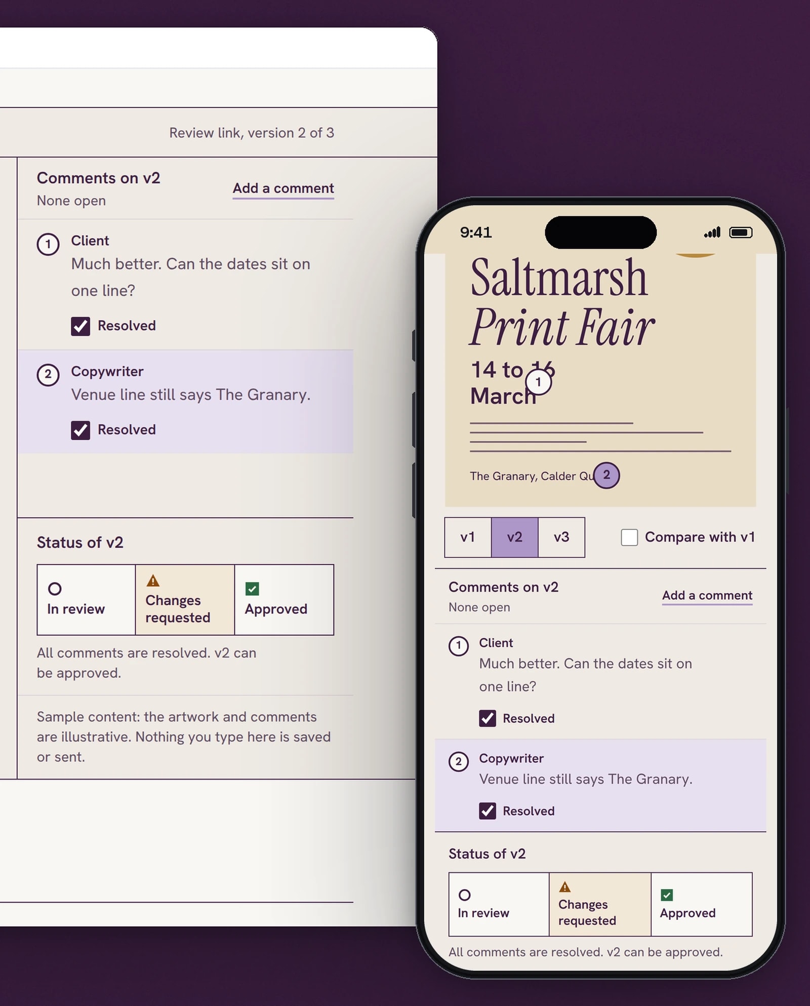
Each comment is a numbered pin on the poster, with the role of the person who wrote it. Selecting a pin opens its comment beside the work.
Two versions, one divider
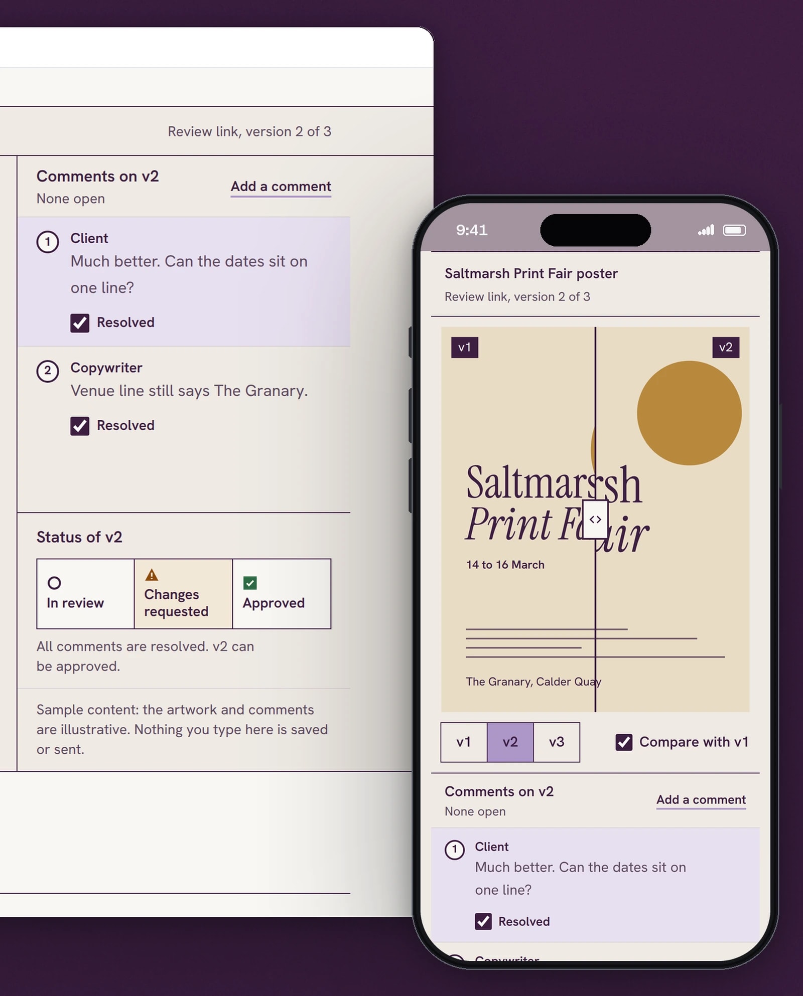
Compare puts the earlier version under the current one. The divider moves by pointer, touch or the arrow keys.
One record of what was approved
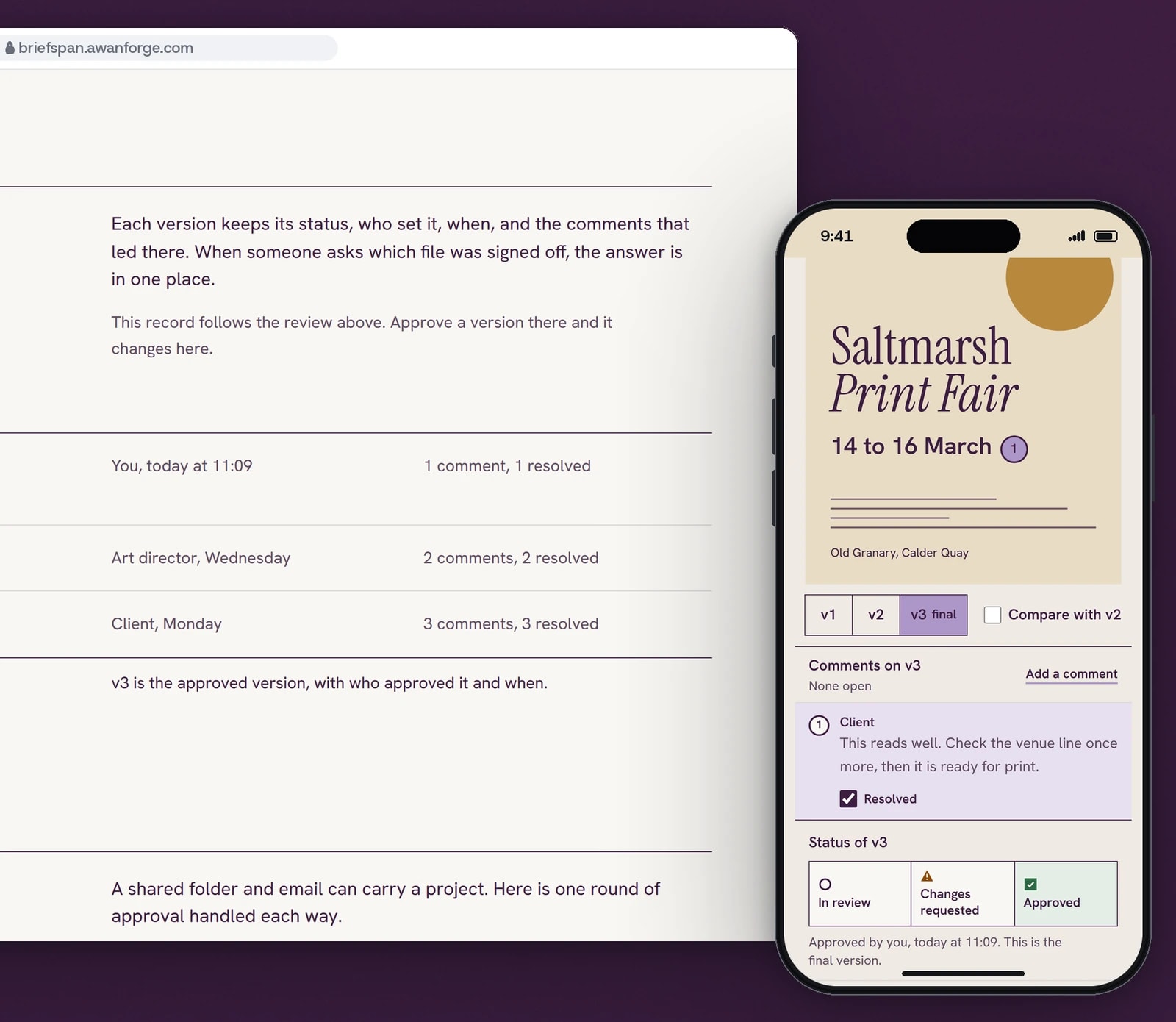
Approve unlocks once every comment is resolved. The record then names the final version, who approved it and when.
Access by request, with one field
A work email is the only required field. The notes beside the form say that no account is created and a person replies.


Pins on the work
Numbered pins sit on the poster and select their comment in the panel beside it. A visitor can place one pin of their own, type a comment and remove it again; nothing they type leaves the page.
Three versions that differ
Version 1, 2 and 3 of the poster change visibly: the dates move, the venue line is corrected. The switch is a radio group, so the arrow keys move between versions.
Compare with a divider
Compare lays the earlier version under the current one with a divider between them. The divider is a native range input, so it works by drag, touch and the arrow keys.
Approval that waits for the comments
Approved stays unavailable, with the reason in words, until every comment on that version is resolved. Approving marks the version final and the record below the review changes with it.
Every change announced
One live region reports each change, such as a new version shown or a version approved, and focus moves to where the next action is.
A form that keeps what was typed
Errors are listed together and linked to their fields. A double click stores one request, a repeat is answered as already received, and a refused or failed send keeps every value for a retry.
Technical choices
What the product is built with, and why.
- One Next.js 16 app, three hostnames
- Briefspan, Shiftcrest and Deskpetal are served by one app that picks the product from the hostname. Each product has its own root layout and its own stylesheet, compiled separately, so no colour or type token reaches another page.
- Tailwind CSS 4 with the default palette removed
- Only the Briefspan colours exist in its stylesheet, each with its contrast measured against the grounds it is used on. Plum is always flat: no gradient, glow or coloured shadow.
- Fonts served from the site
- Instrument Serif and Hanken Grotesk load from the site’s own files with size-adjusted fallbacks, so the swap does not move the hero. Both are under the SIL Open Font License.
- SQLite for lead requests
- Each request is stored once: the form sends a key that makes retries safe, a hidden field and a signed form token stop simple scripts, and a rate limit answers with a wait time the form counts down. Requests are read, exported and deleted in a signed-in area with a password and an authenticator code.
- Counts without cookies
- Page views, preview use and form steps are stored as daily totals per product, with no cookie, visitor id or typed text, and automated browsers send none.
- Playwright in three browser engines
- The review, the form and every page are tested in Chromium, Firefox and WebKit, with axe checking WCAG 2.2 AA on each page and on the review in its main states.
Outcomes
374 automated checks passing in three browsers
The final run across the three products passed 374 checks with none failing or skipped: the review by pointer and keyboard, the form in every state including a rate limit and a server error, metadata, reduced motion, pages without JavaScript, and accessibility at 390 and 1440 px.
Evidence: the project’s QA record of 11 November 2026, run on the production build in Chromium, Firefox and WebKit.
Lighthouse 95 to 97 on a simulated phone
On Lighthouse’s simulated slow 4G phone the page scored 95 to 97 for performance, with the largest element on screen in 2.1 to 2.4 s and no layout shift.
Evidence: Lighthouse 13 lab runs recorded in the project’s QA record of 11 November 2026. These are lab measurements; no visitor data is behind them.
Briefspan is an Awan Forge product at the landing-page stage. The review on the page runs in the visitor’s browser on an illustrative poster and illustrative comments, and nothing typed into it is saved or sent. There is no account system or review service behind it yet; the request form stores real requests for access, and a person at Awan Forge replies by email. The logo was rebuilt as a vector system from approved artwork.
Launching a product before it is finished?
We build landing pages where the product can be tried on the page and every claim is one the page can show. Tell us what you are building and who it is for.